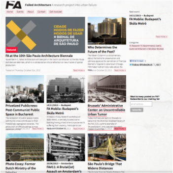
 ABOVE: Screenshots of the banner and homepage of Failed Architecture. | "[...] the best visited online architectural media are preoccupied with the eye candy produced by architects, without being critical about current or future developments." |
Having explored the website and reading some of their articles, I have indeed gained a better understanding of what constitutes bad, or failed, architecture. It was surprising to see how many varieties of examples they could find, from cold war structures to modern day bridges. It has become more clear to me that for architecture to fail, it does not simply need to topple over. The failure of a piece of architecture, more often than not, can lie in the context. More specifically, the failure can lie with the inability of the structure to respect the context.
Maximum Size, Minimal Function
| The example in the image to the right shows Brussels' Administrative Center, also known as "an Uncontrollable Urban Tumor" (Failed Architecture. 2013, Online). This building was built on a colossal scale only a short distance away from the historical centre of Brussels (Failed Architecture. 2013, Online). It is seen as a division of the city by many locals, despite the fact that it was meant to unite Brussels through providing one place for it's civil servants to work (Failed Architecture. 2013, Online). The project was met with problem after problem and eventually became nothing but an empty shell waiting to be rented out. Proposed ideas to restore it and rebrand it were even dismissed after compromises could not be made in the designs. I feel that the problem with the architecture here is that it did not suit the time or the place that it was built. In a time of unification, the building managed to divide the city. Instead, it should have been designed to work with the idea of unification, perhaps that should have been the primary concern of the brief. Furthermore, the historical location of the site has been seemingly ignored. This giant structure of metal and glass is debatably too | 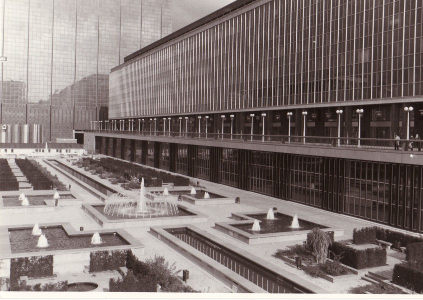 (Failed Architecture. 2013, Online). "Even before the last tower was finally completed, the complex was heavily criticised for being such an enormous, mono-functional block, completely dividing this part of the city centre." |
contemporary for it's context, or at least in the way that it has been implemented. In my opinion, the style of the building could have been made to work as long as the scale had been more appropriate.
To solve these kinds of issues, a design should ultimately adhere to its context. Be that in a way in which the building blends in with the context, or be it in a way which complements it. The unification of Brussels was what caused this building to exist. The solution to avoiding this problem should have begun at the start, designing with focus on what the building was trying to achieve and celebrate, instead of just trying to build the biggest building they could.
To solve these kinds of issues, a design should ultimately adhere to its context. Be that in a way in which the building blends in with the context, or be it in a way which complements it. The unification of Brussels was what caused this building to exist. The solution to avoiding this problem should have begun at the start, designing with focus on what the building was trying to achieve and celebrate, instead of just trying to build the biggest building they could.
Out Of Touch
| This bridge in São Paulo is an example of how architecture can fail to stay in touch with the needs of the city. It is fine to design a building or other structure however you wish, but it must be placed in the right context. If you are provided with the opportunity to design for a specific site, the rules are slightly different. Surely it makes sense to design something which will work with the context of the site? This is not to say that I have a problem with creating something entirely different or making a statement, some of the most famous pieces of architecture do just that, but ultimately it must work and function properly within it's environment. Although a rather large quote, the text to the right states exactly what some of the worst failures surrounding the bridge are. It failed instantly when it neglected the existence of cyclists, public transport and pedestrians. There is a ban of anything but personal vehicles crossing the bridge. The structure is essentially designed on a metropolitan scale, but has been placed into an urban setting (Failed Architecture. 2013, Online). It displaced a lot of local people, the majority of whom could not afford to live in the area. In my opinion, the bridge is almost a statement of how São Paulo is trying elevate it's status. They have removed the less affluent members of the city to create a giant structure designed specifically for those have enough money to cross it. Baring in mind that no public transport, cyclist, nor pedestrian can cross it, the bridge doesn't only allow just people with enough money to buy their own car to use it, it encourages it. Whereas this may not seem like a big deal at first, in actual fact it goes against the entire global context. A lot of places are trying to become more eco friendly and encourage less use of individual transport. Through this bridge, São Paulo is publicising an alternative message. | 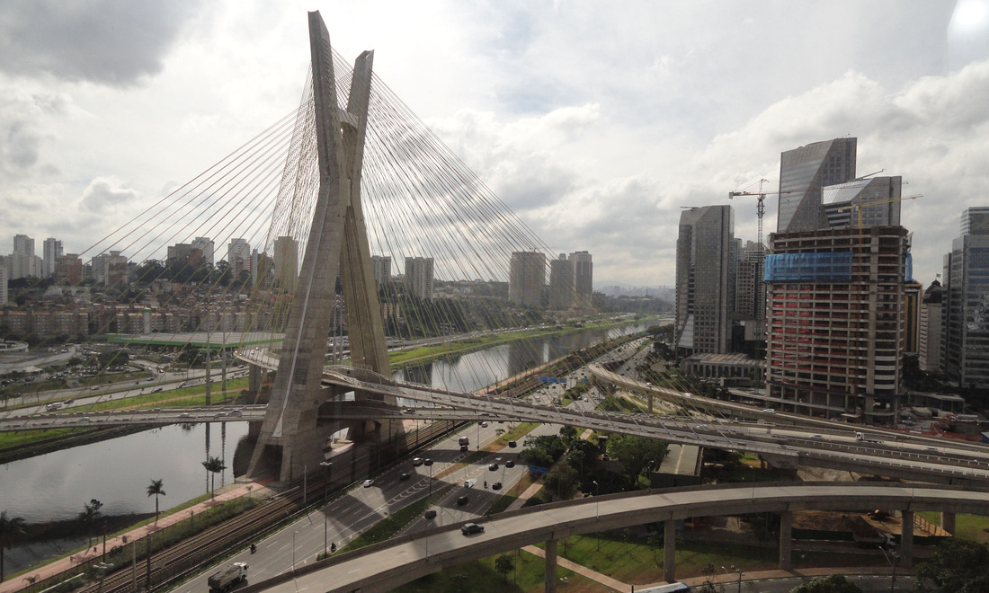 (Failed Architecture. 2013, Online). "In the case of ‘Urban Operation’ Água Espraiada, most resources were invested in road infrastructure, undermining the importance of providing social housing for the large number of local dwellers who had been displaced. Six times more money was spent on the bridge itself than the complex with 252 social housing units and public facilities (nursery, restaurant-school and health center) that has been recently - and still partially - inaugurated. Whereas all the favelas in the area were demolished, only ca. 5% of the local dwellers remained in the area, relocated in this new complex. The vast majority, however, ended up expelled and moved to other favelas in the city’s outskirts, out of the elites’ sight." |
This kind of failure should never occur. It should be avoided. In my opinion, this problem is mostly down to the people who commissioned the bridge. They showed disregard for the existing problems that effect the city and created solution to a problem that didn't necessarily exist. All projects should do their best to incorporate a city and it's people. This should be a key factor during the design process.
One More Thing...
| I was reading about a department store in Rotterdam which was ready to be demolished but was saved by a brand new project. This got me thinking about additions and alterations to buildings, as well as the future of them. As stated in my opening quote to this post, Failed Architecture reveal their interest in the future prospects of development. The biggest failure that became apparent to me from reading the Rotterdam article was that people kept trying to change it. The quote to the right states how aspects of the building were changed and altered. They were trying to save the building from it's downfall by making adjustments tot he structure, but instead of making sensible or beneficial ones, they were stripping it of what made it great. The newest change to this department store is something considerably different. A 16 storey building is being built on top of it to provide housing. The department store has become a foundation for something new. I applause this idea, I think it is a clever thing to do. However, I believe that the department store should become more than just a foundation, it should be a part of the new development and have more of a roll to play. If this does not happen, it simply becomes an over elaborate shell for something new to sit upon. In my opinion, if something is in need of alteration then the changes should allow the building's merits to be shown off, exemplified. The failure here is to remove what made the building great. Instead of preventing a downfall, the architects and designers most likely encouraged one. | 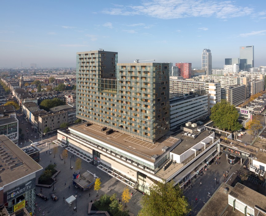 (Failed Architecture. 2013, Online). "It had undergone various transformations, including the addition of two storeys in 1977 and the removal of a distinctive café terrace, which used to jut from one corner of the volume at an angle. Only experts could still detect its architectural merits. Things didn’t look good." |
Avoiding Failure
Failure in design can be avoided. Ultimately it lies within design, the design should always try to adhere to the context which surrounds it. Take the bridge in São Paulo for example, if it were in the right place then it may well have been celebrated. There is more to design than simply putting pen to paper though, it is not just about aesthetics or even function. A good piece of architectural design must be able to integrate and respect its surroundings. Failure can come from ignoring what is needed. The Brussels Administrative Center ignored the celebration of unification, the bridge in São Paulo ignored the citizens of the city and department store in Rotterdam had it's own features ignored and stripped away. To me, the way to avoid failure in architecture is simple, to pay attention.
Failed Architecture. (2013). Failed Architecture. Available: http://failedarchitecure.com. Last Accessed 1st November 2013.
Failed Architecture. (2013). About. Available: http://failedarchitecture.com/about/#ixzz2jL189rtd. Last Accessed 1st November 2013.
Failed Architecture. (2013). Brussels' Administrative Center: An Uncontrollable Urban Tumor. Available: http://failedarchitecture.com/2013/10/brussels-administrative-center-an-uncontrollable-urban-tumor/#ixzz2jL6qK5Hc. Last Accessed 31st October 2013.
Failed Architecture. (2013). São Paulo's Bridge That Widens Distances. Available: http://failedarchitecture.com/2013/10/sao-paulos-bridge-that-widens-distances/#ixzz2jLAvp0zD. Last Accessed 31/10/2013
World-Wide-Matel. (2011). São Paulo (1). Available: http://johnsonmatel.com/blog1/2011/08/sao_paulo_1.html. Last Accessed 1st November 2013.
Failed Architecture. (2013). Saviour Or Parasite? Available: http://failedarchitecture.com/2013/08/saviour-or-parasite/. Last Accessed 1st November 2013.