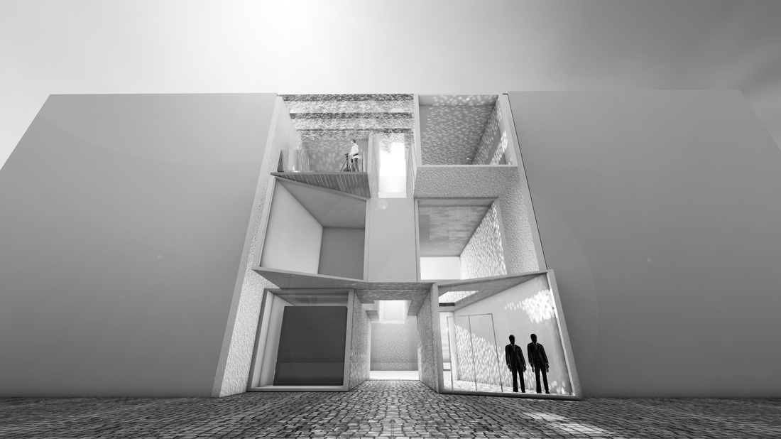
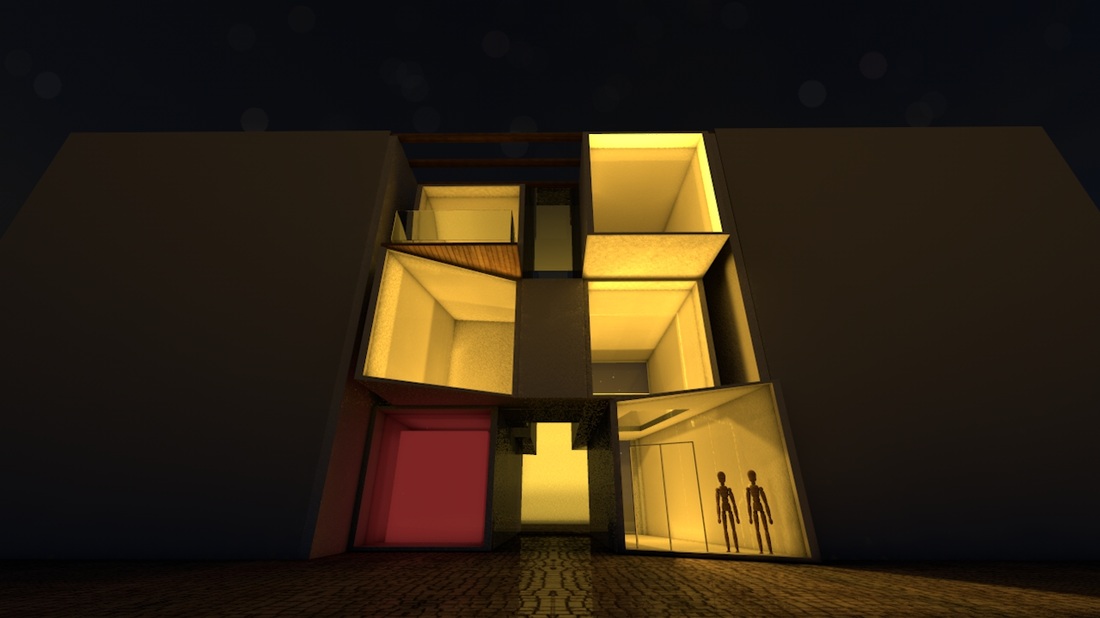
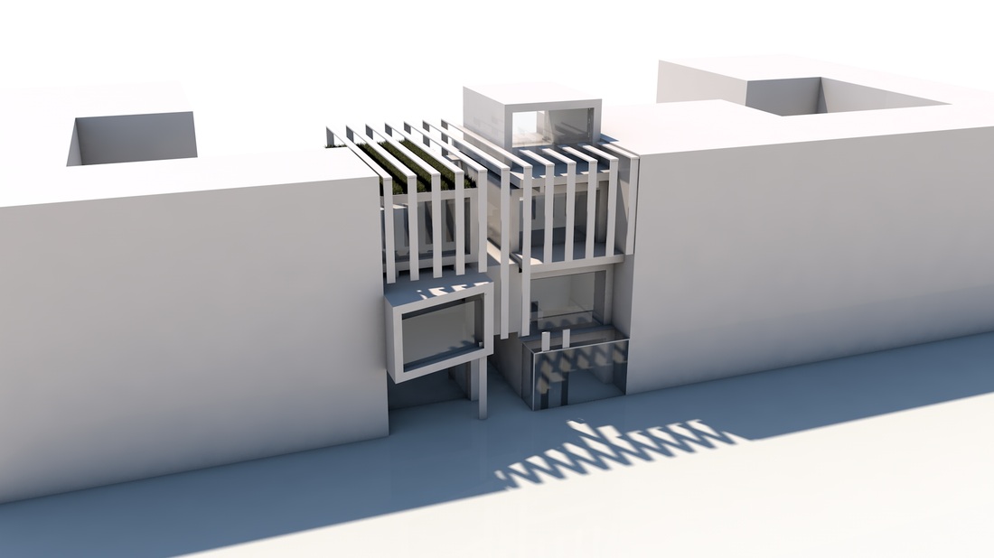


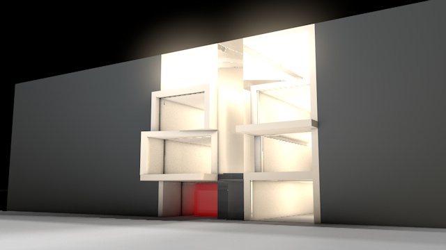
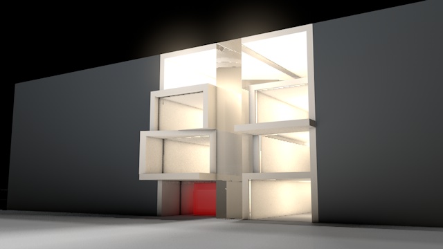
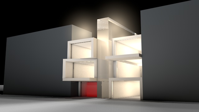


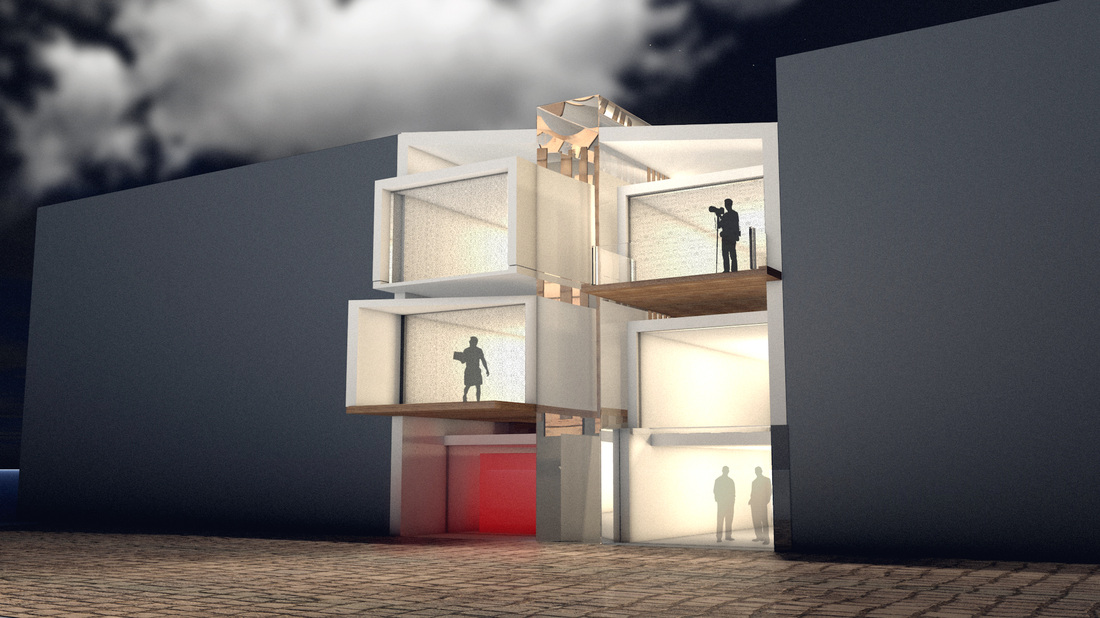
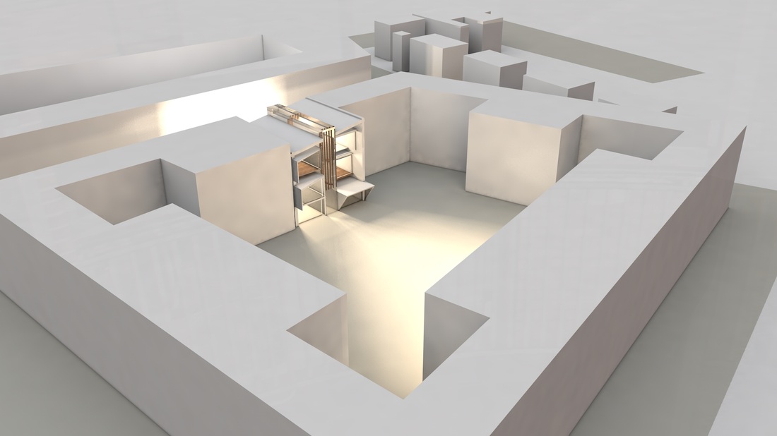
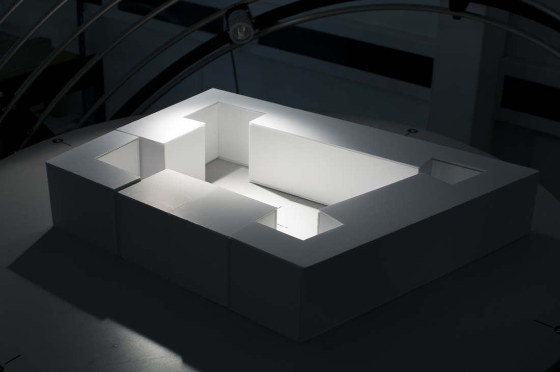
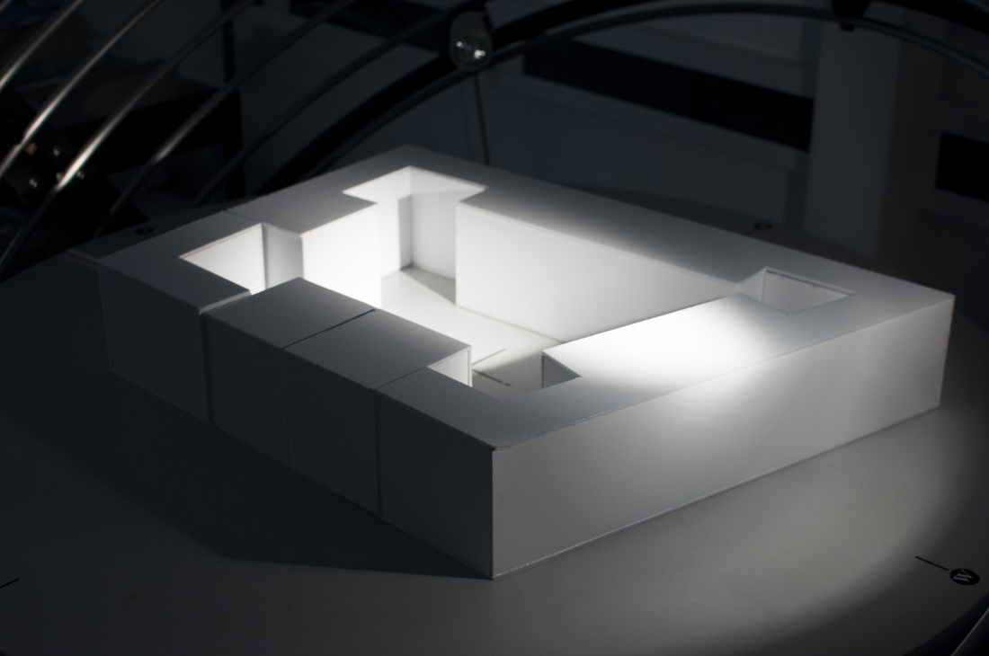
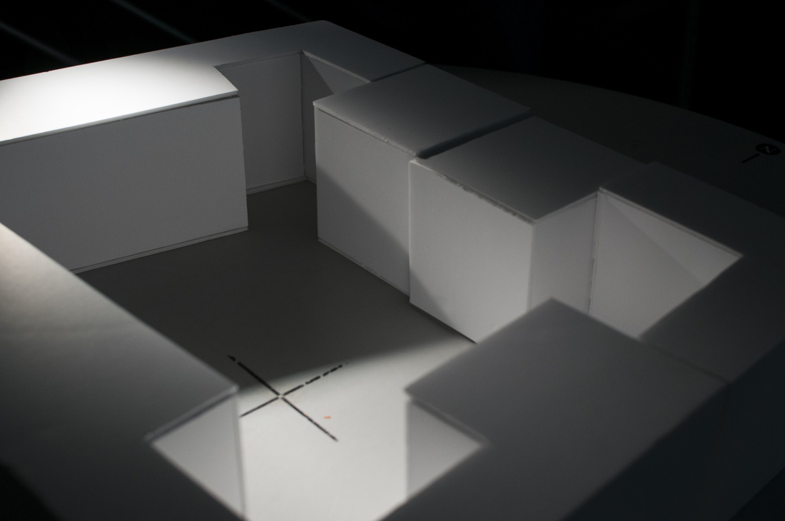
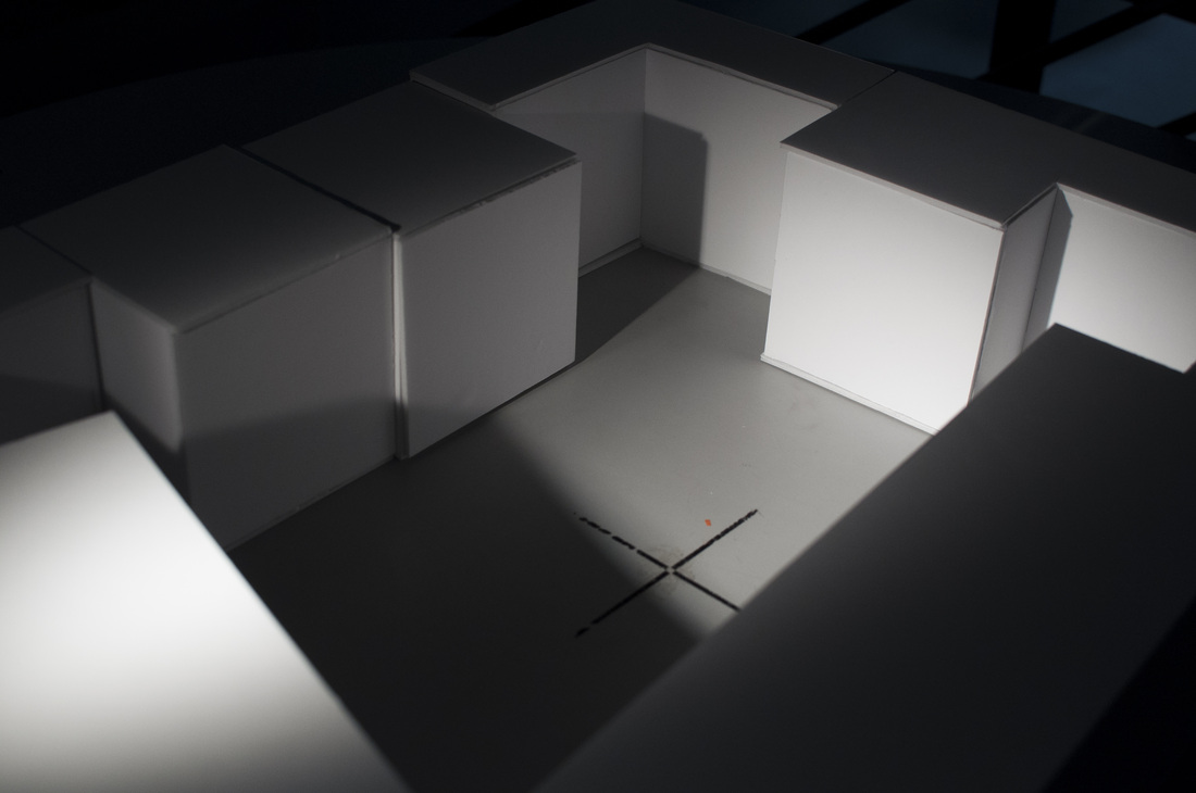
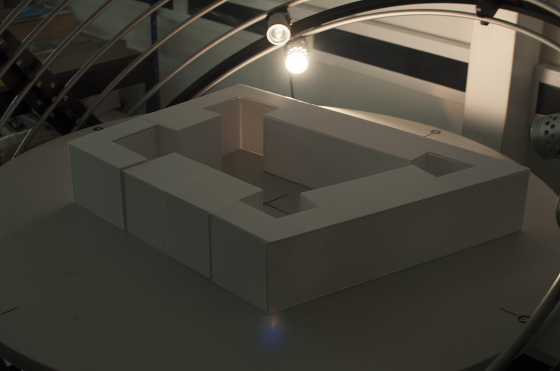
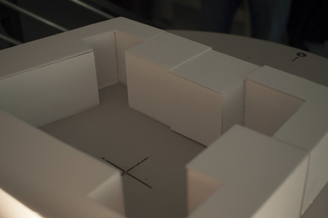
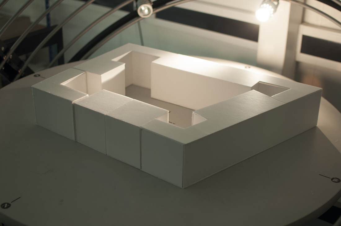
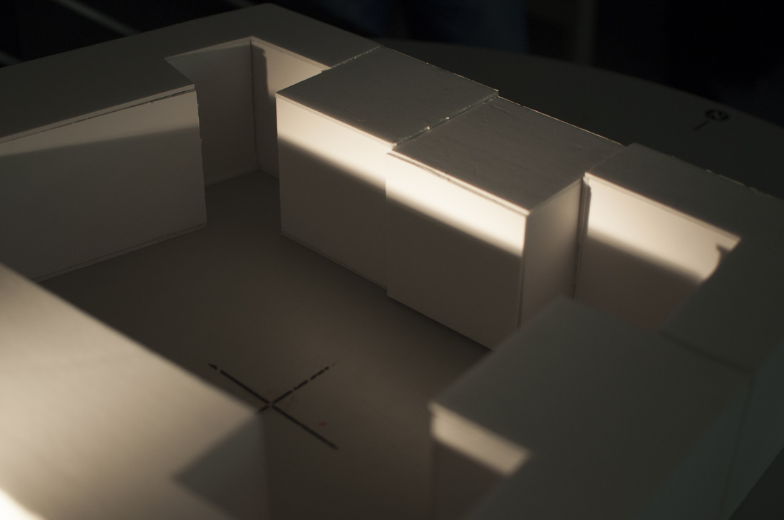
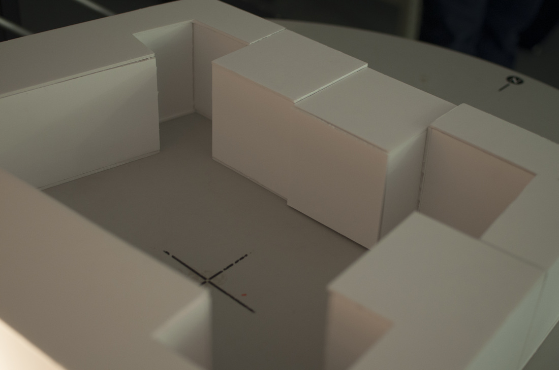
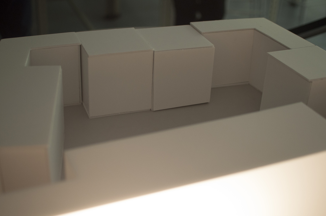
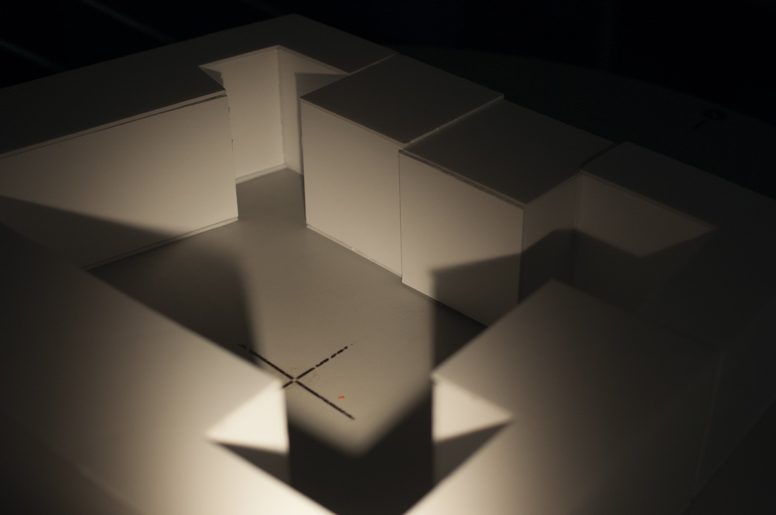
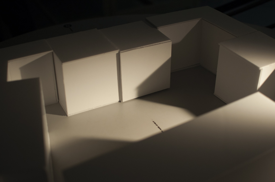
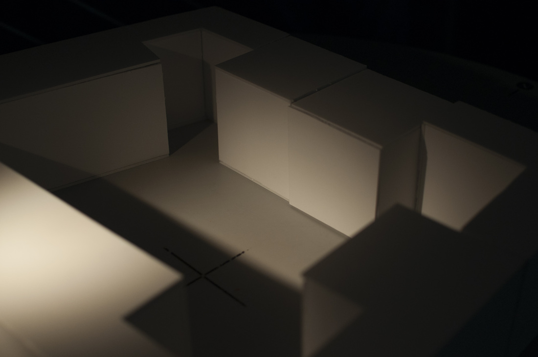
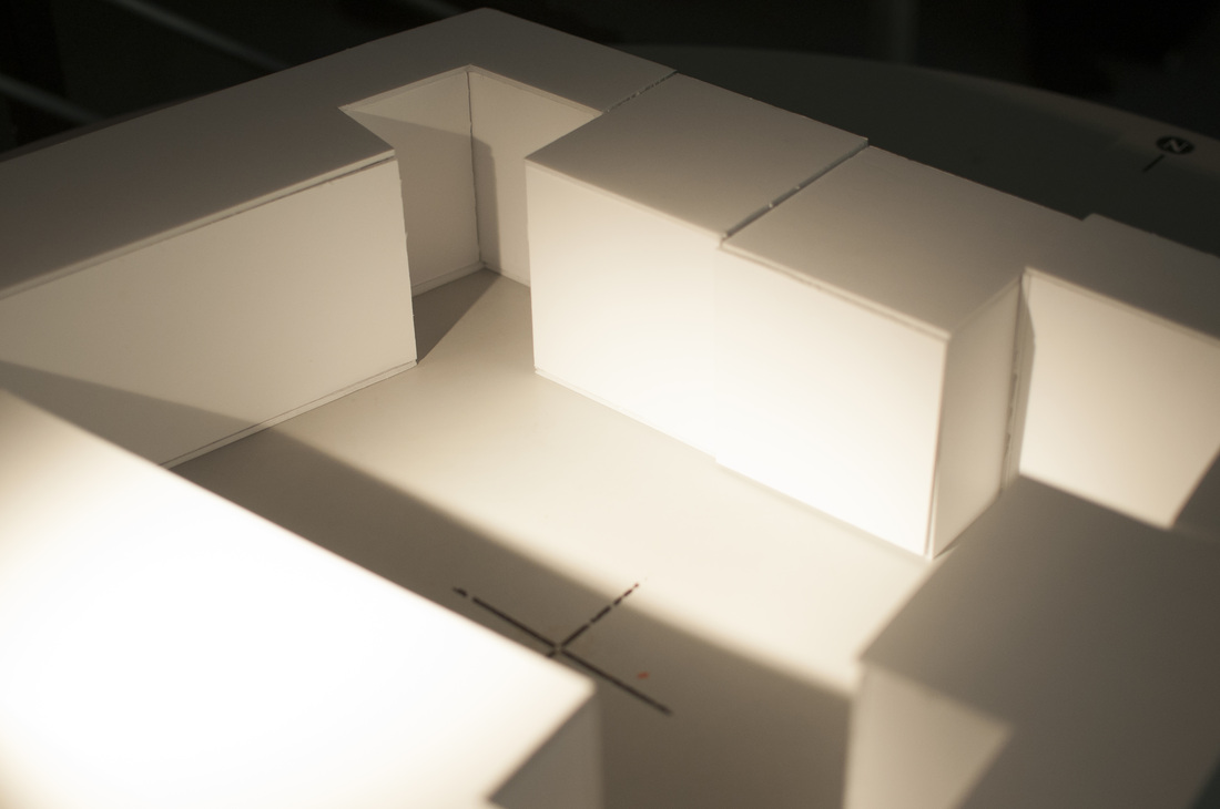
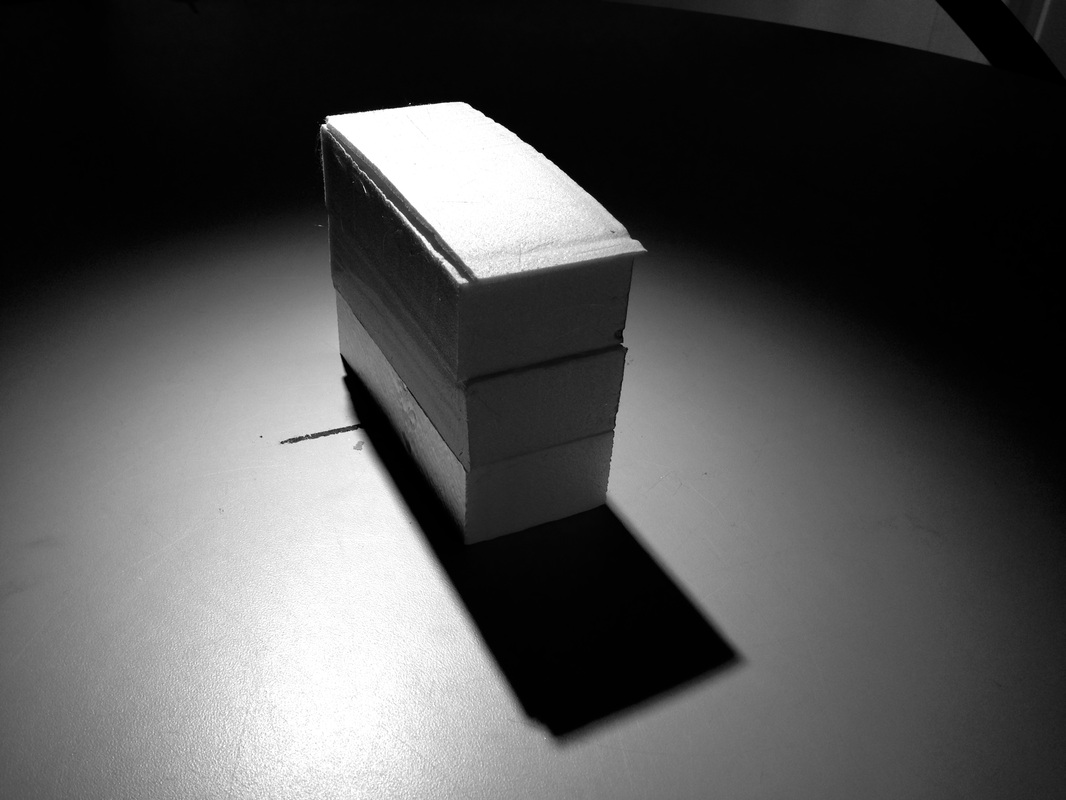
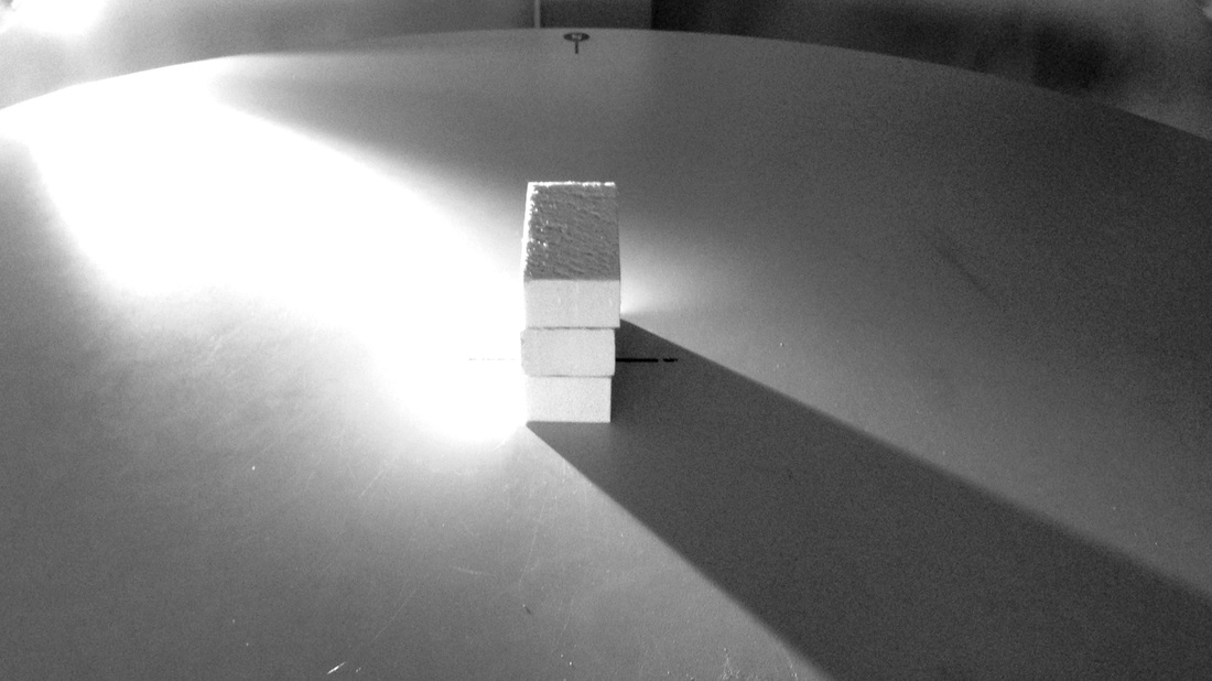
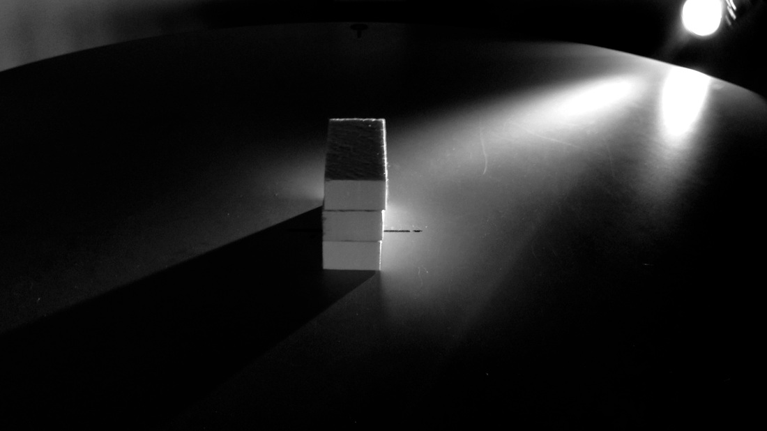
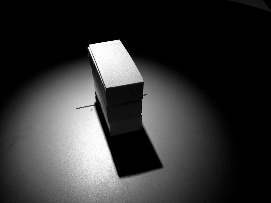
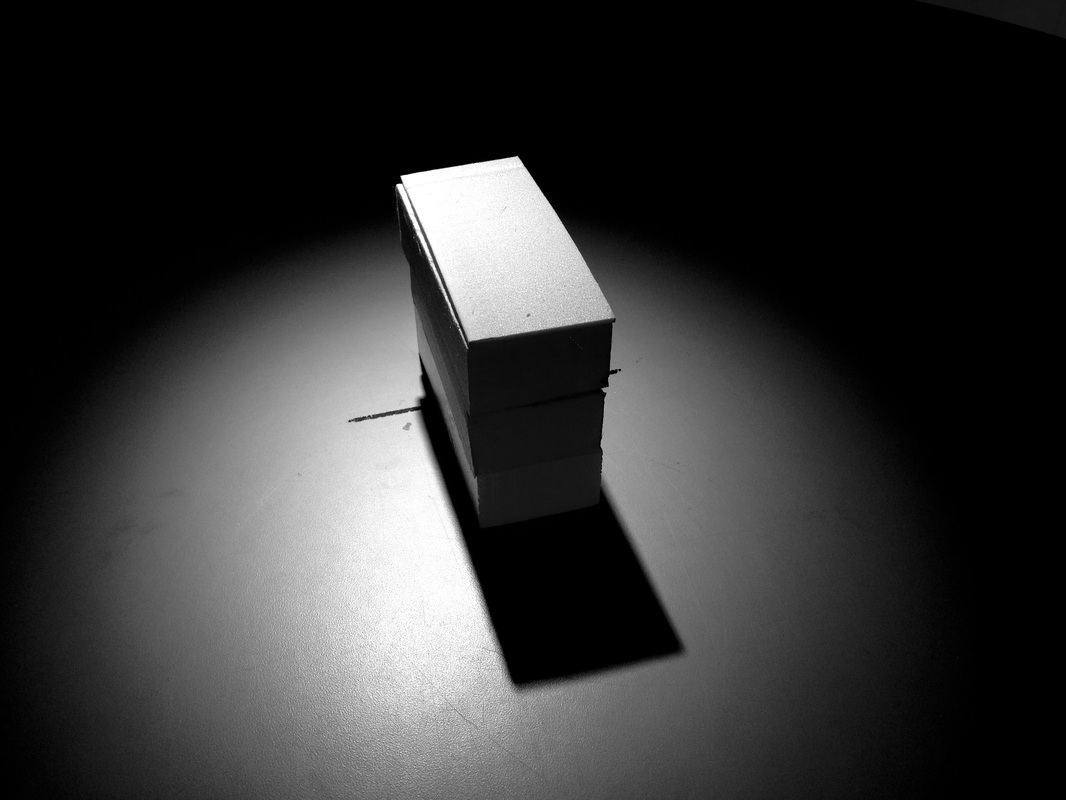
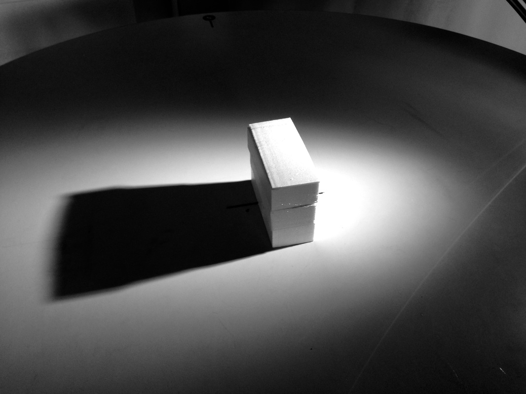
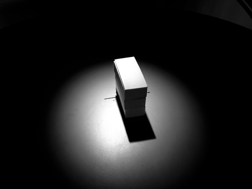
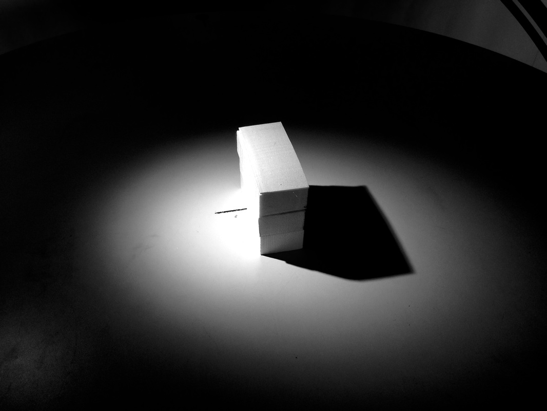
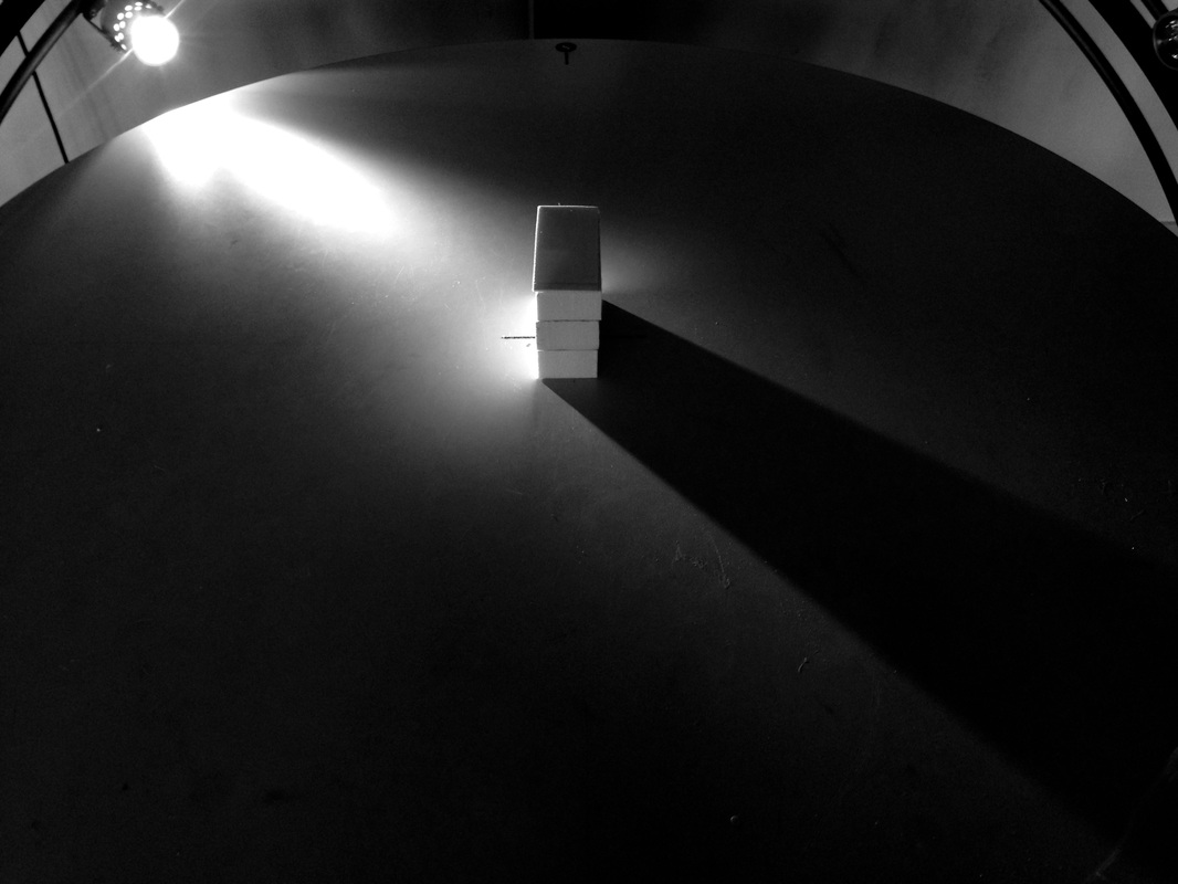
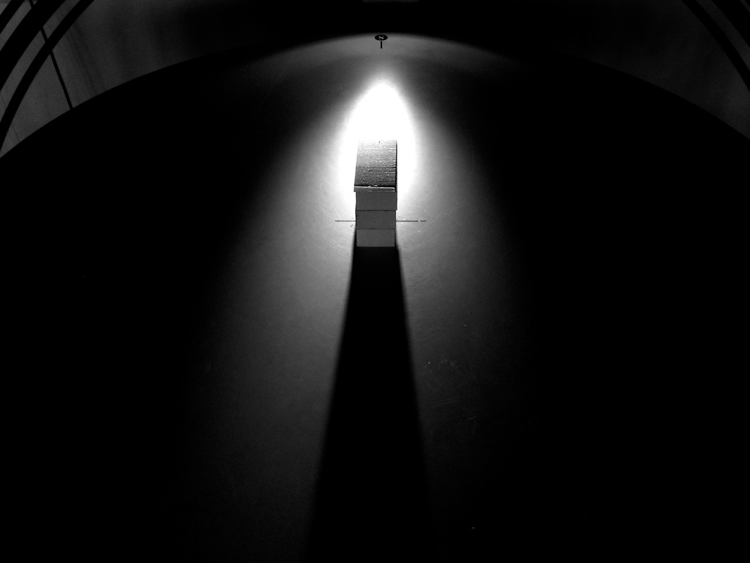
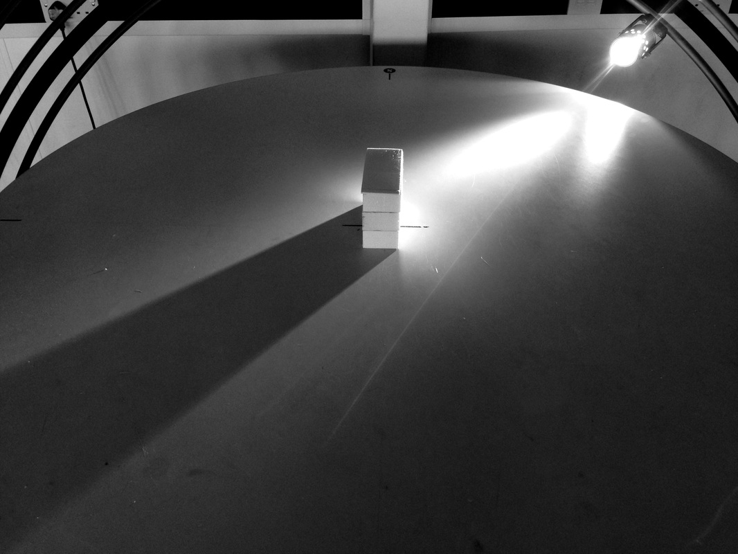
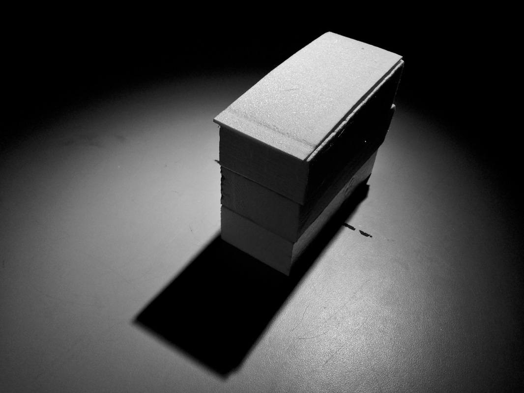
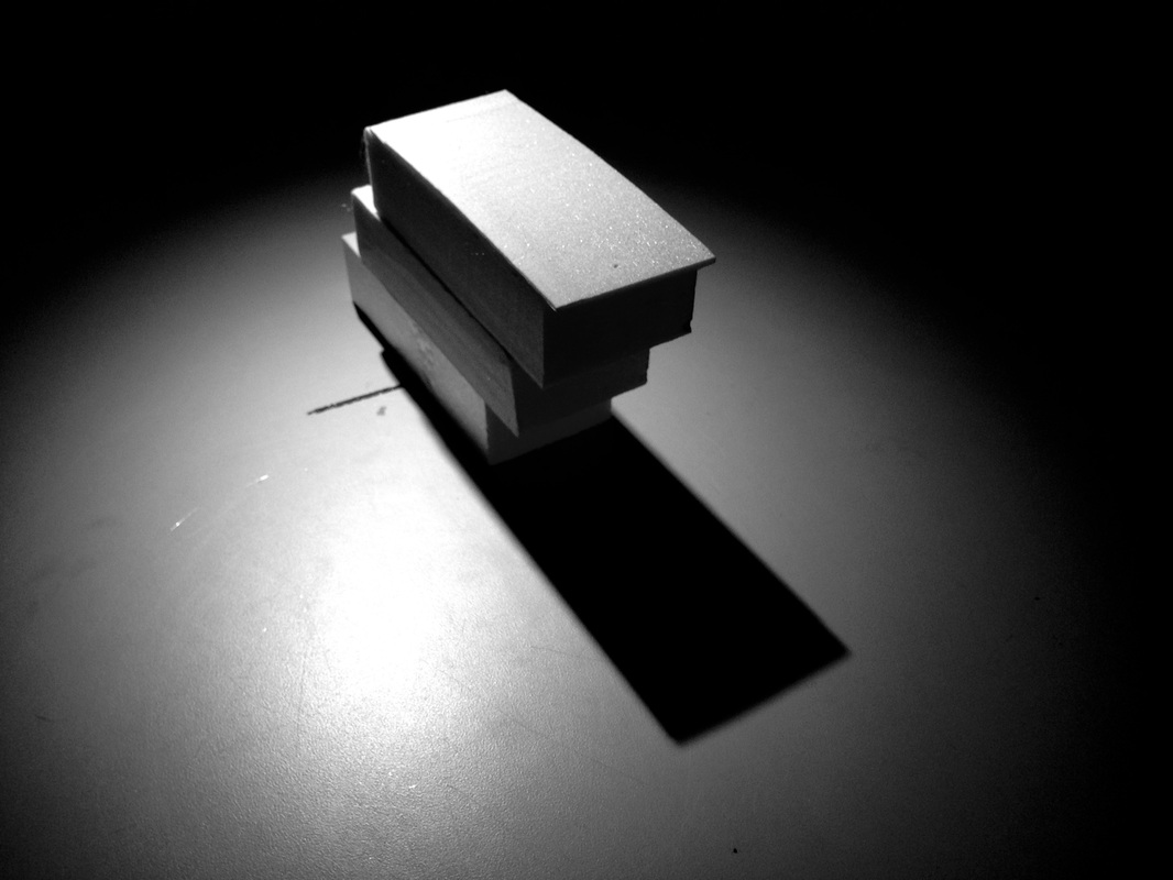
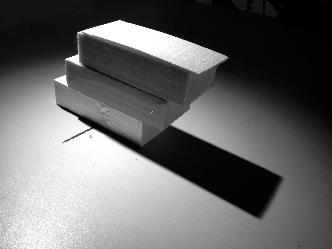
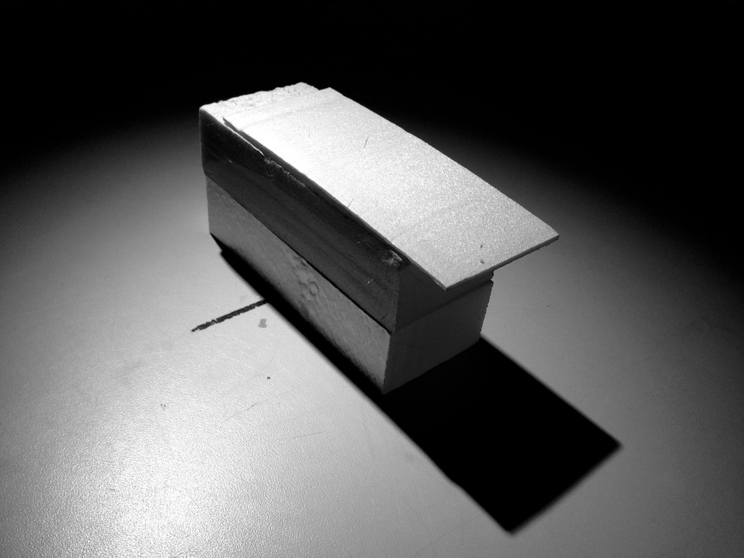
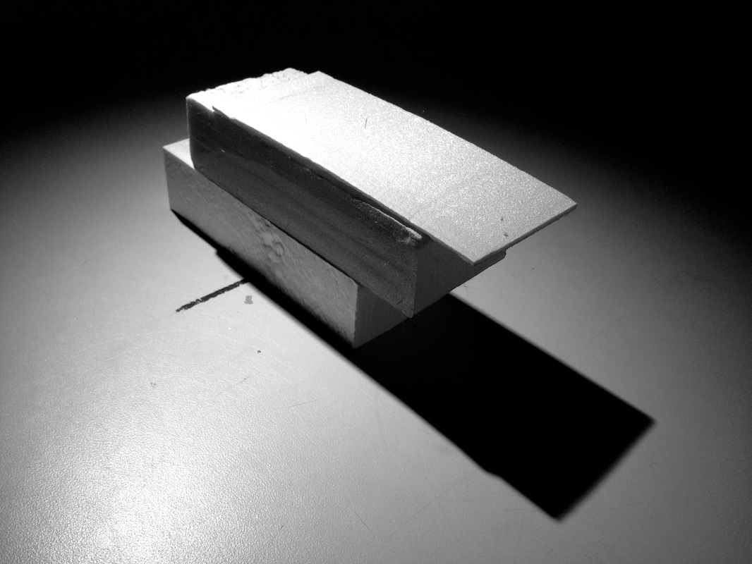
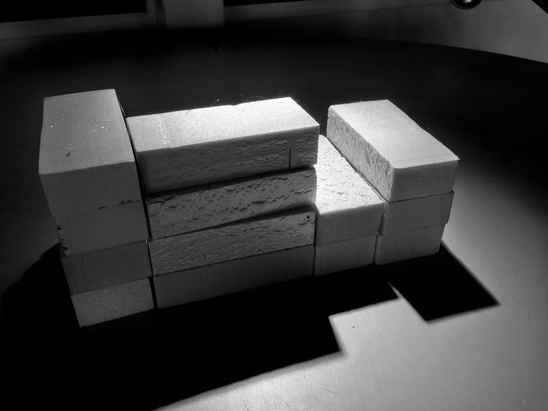
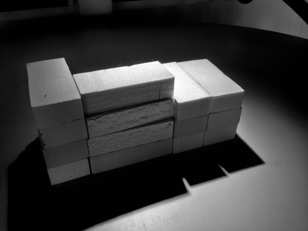
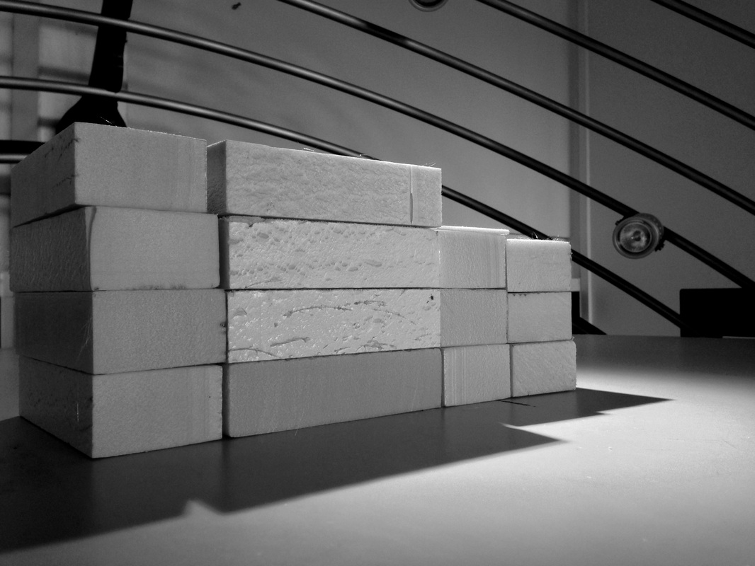
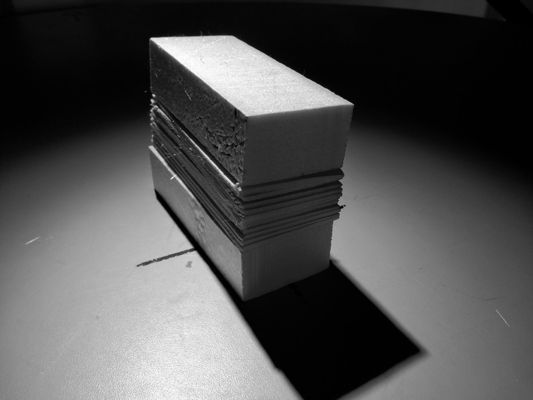
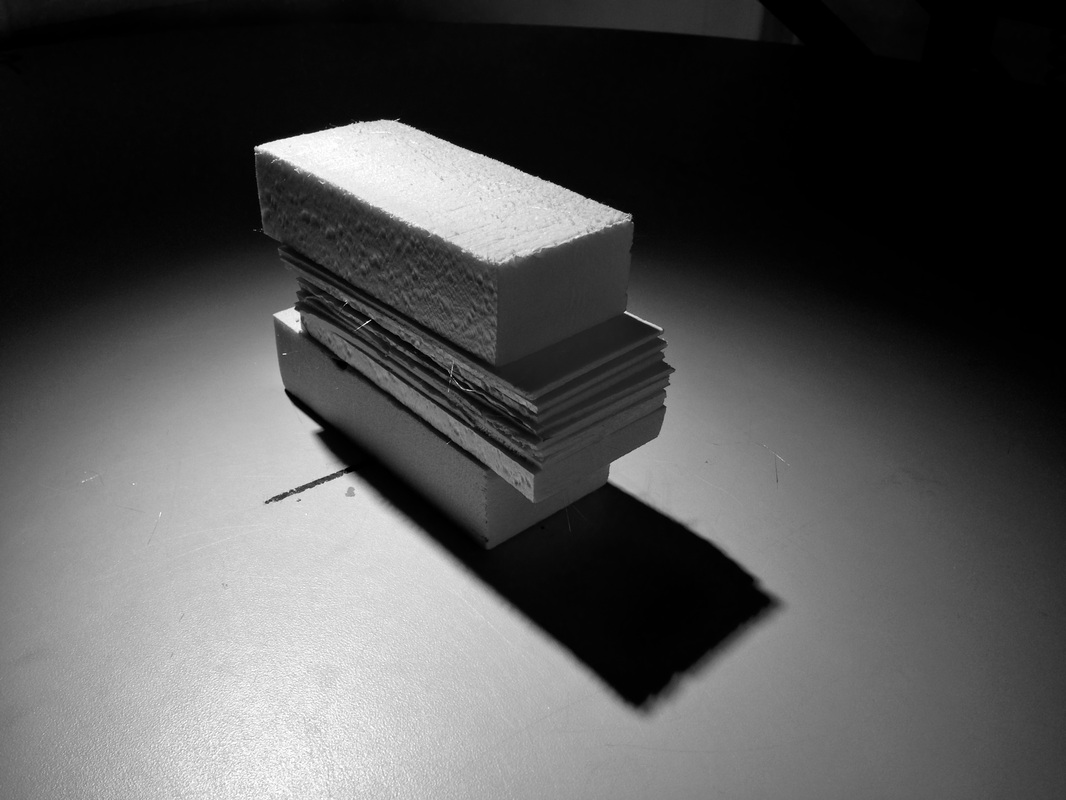
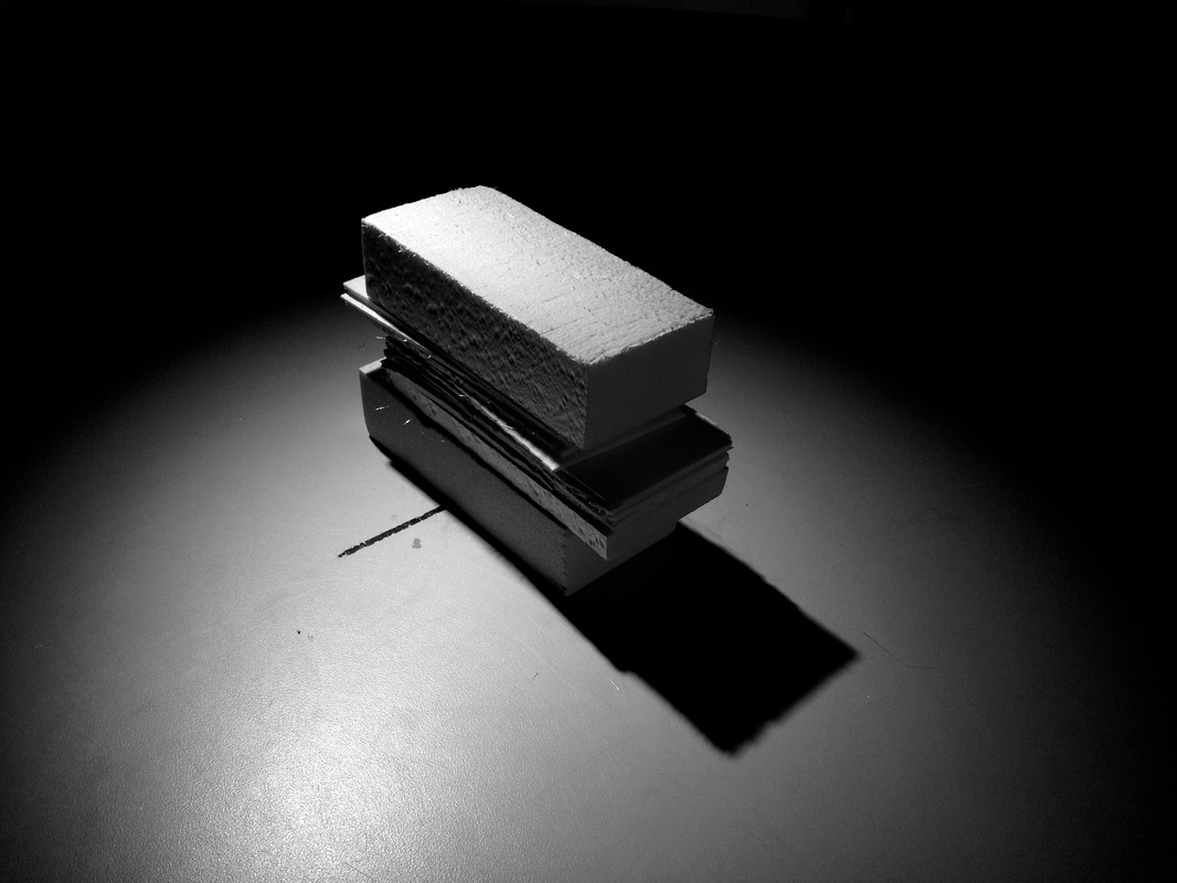
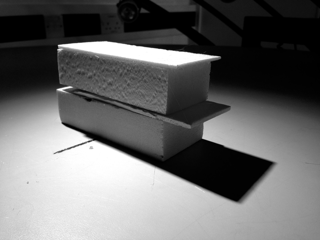
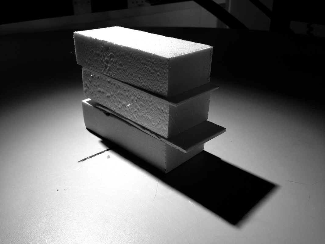
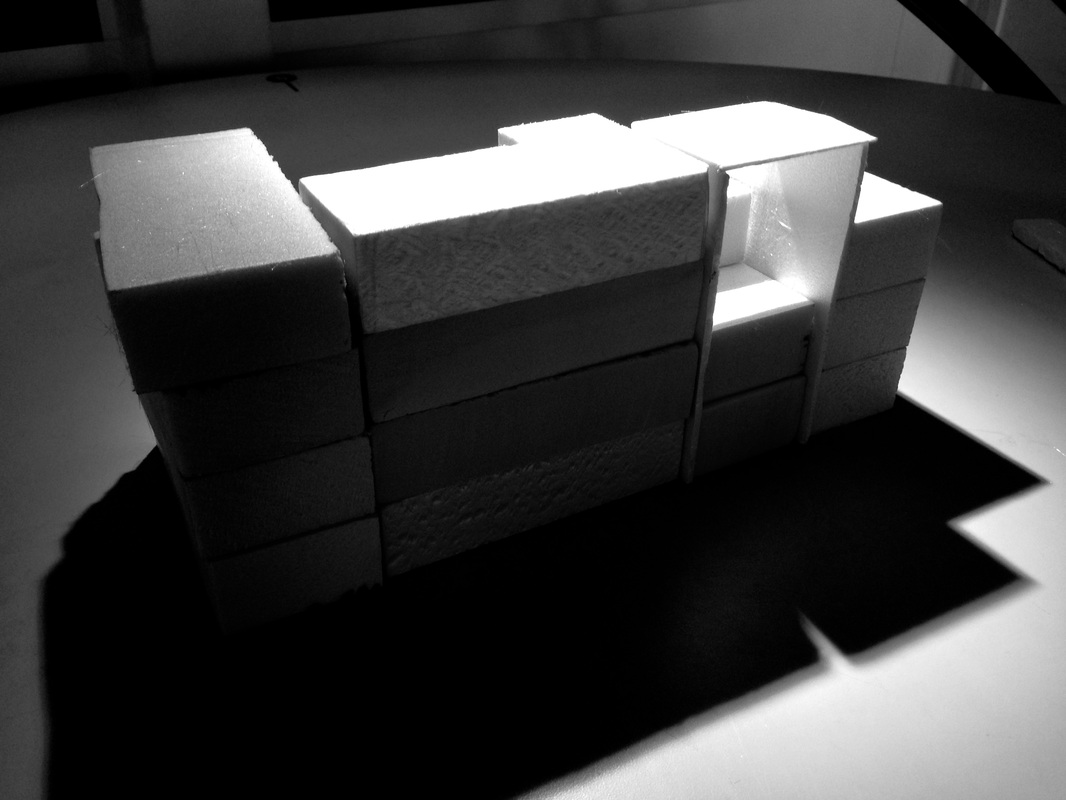
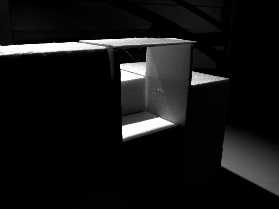
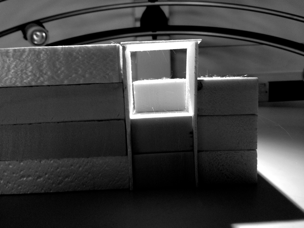
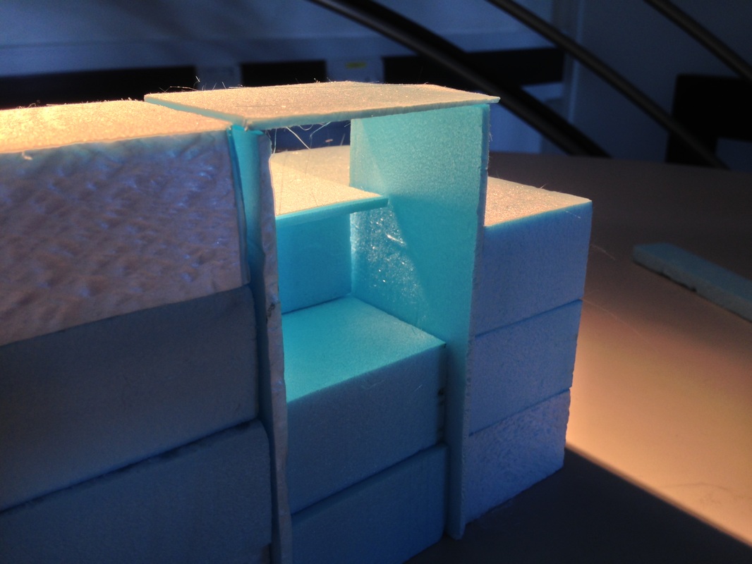
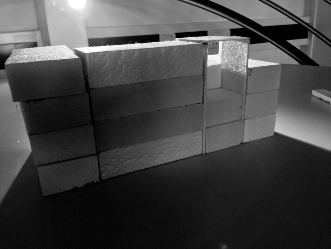
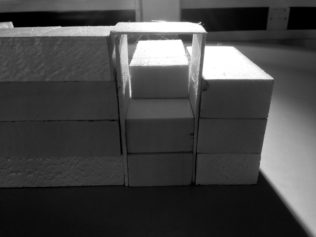
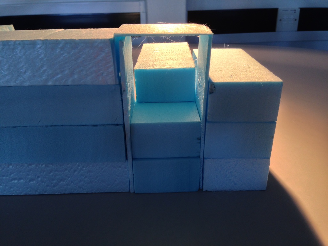
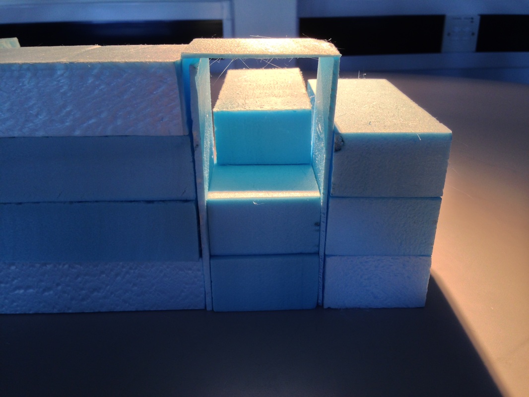
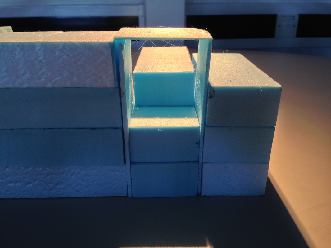
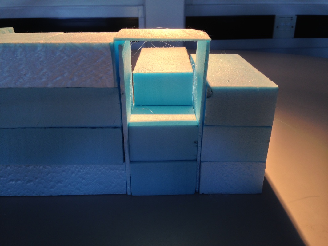
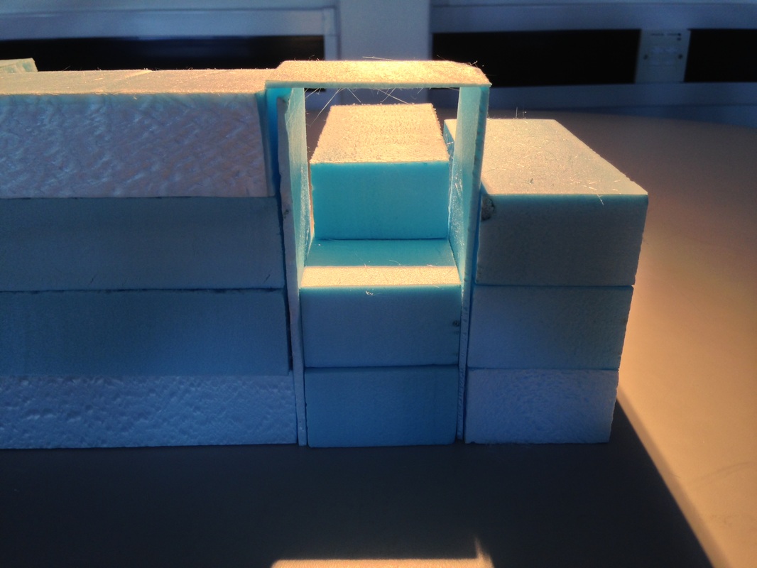
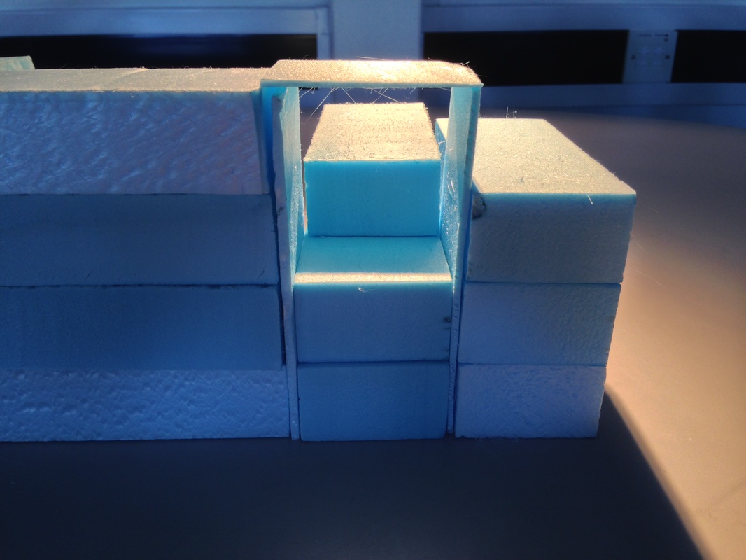
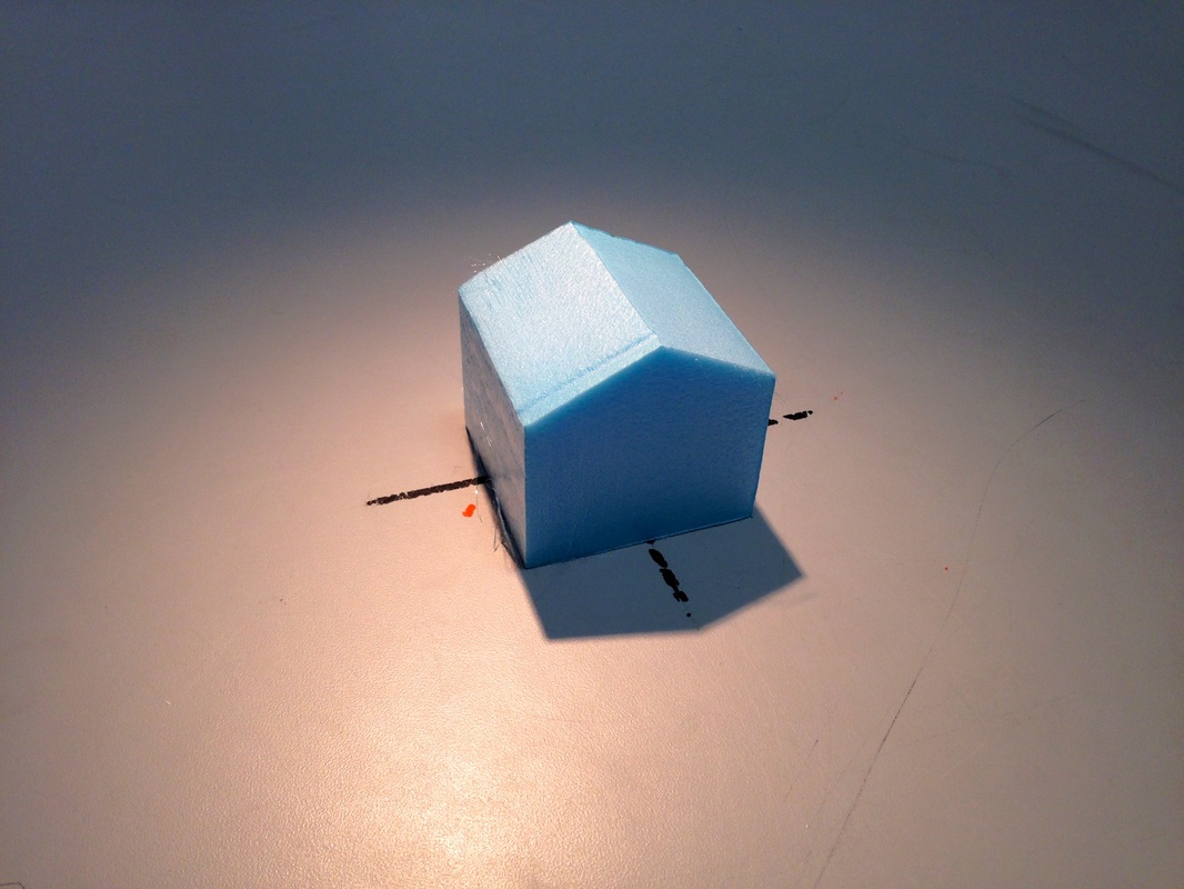
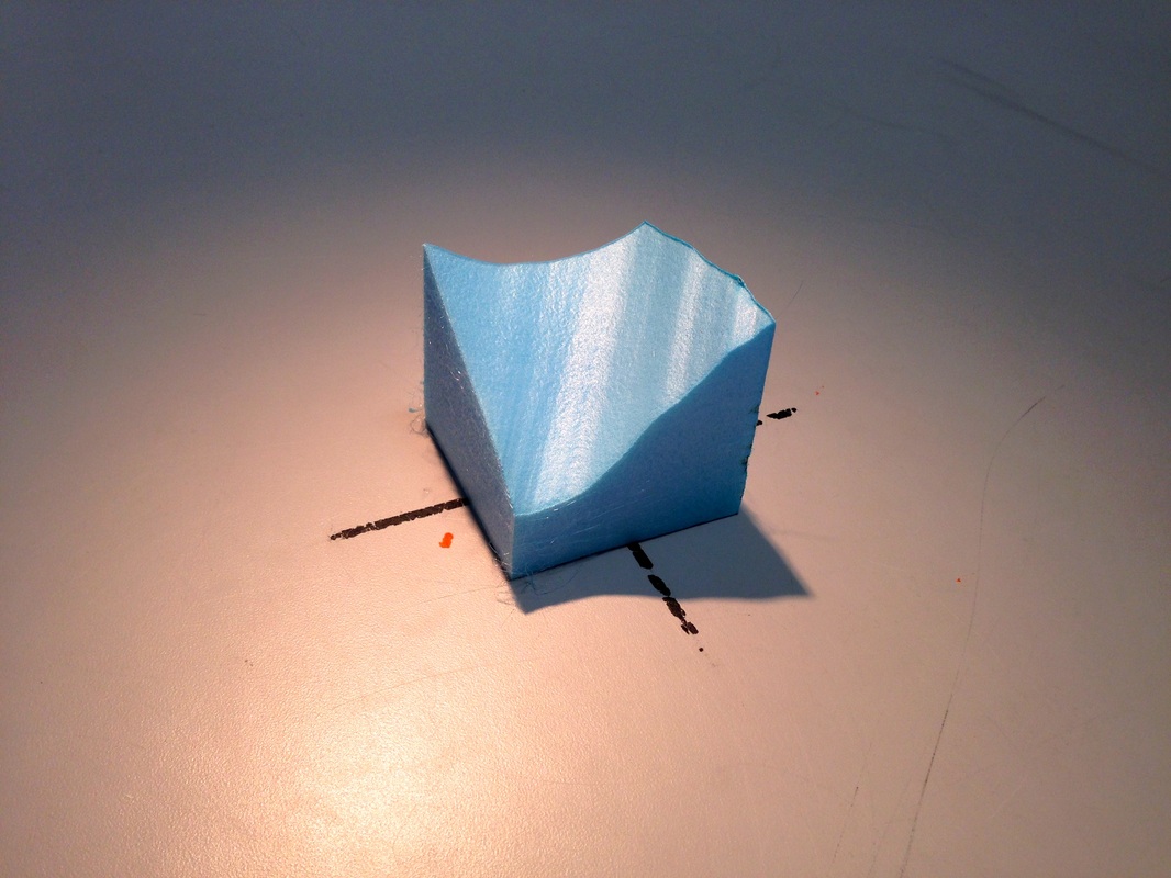
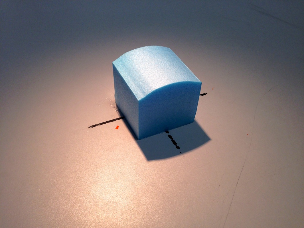
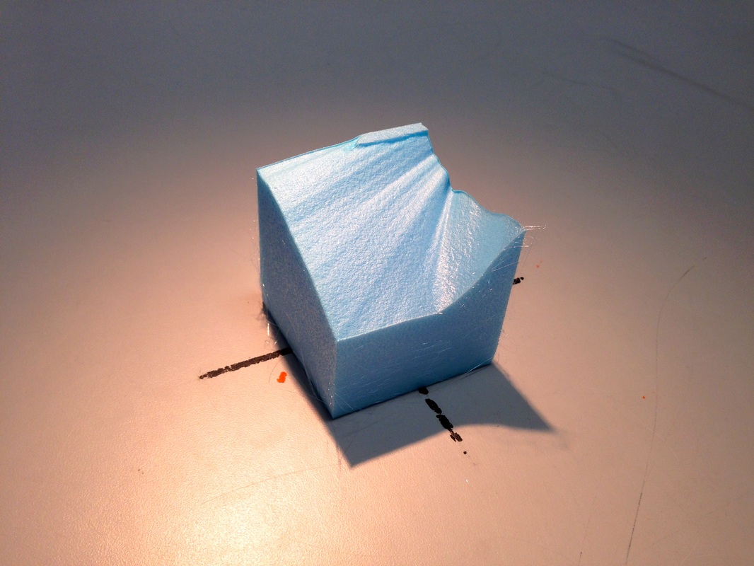
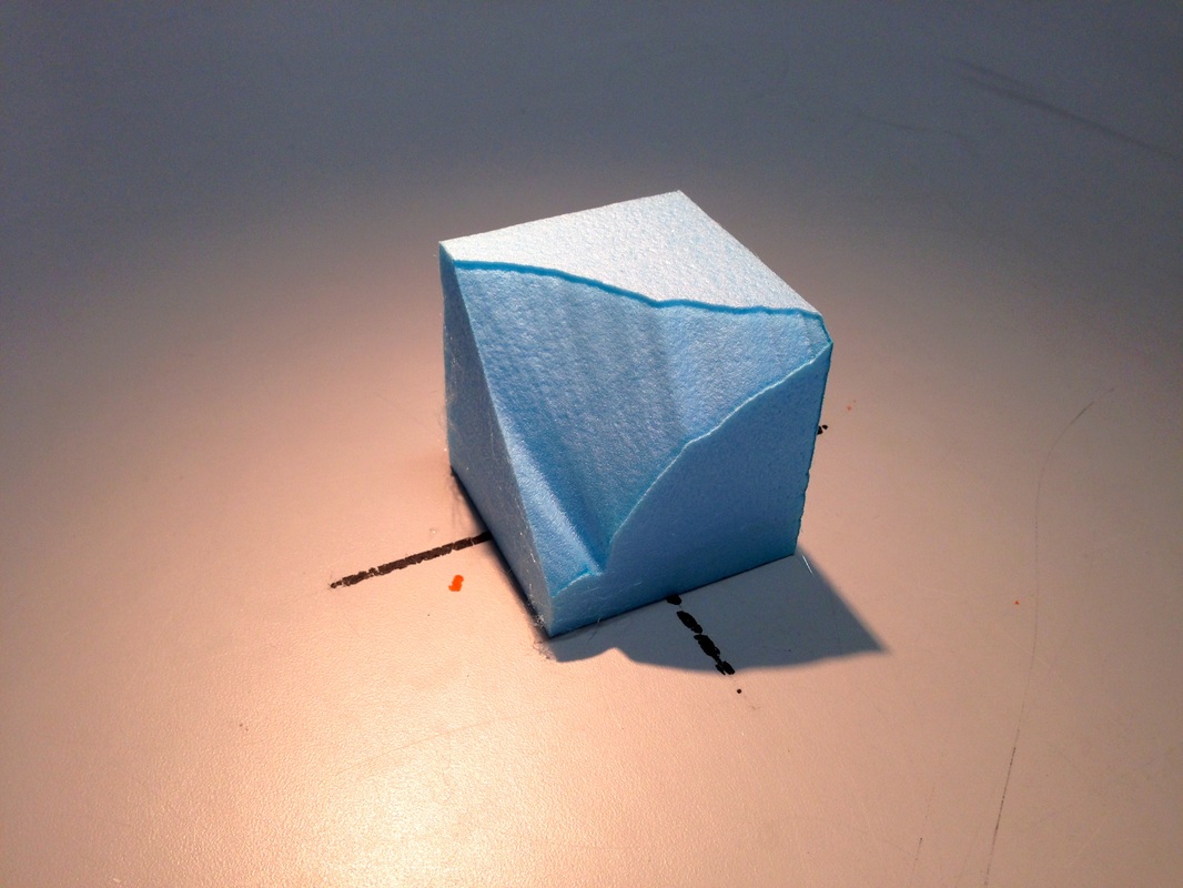
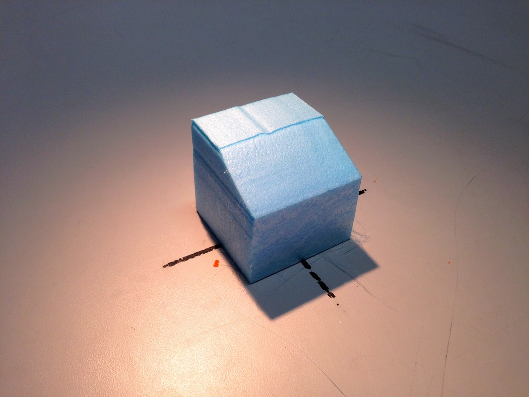
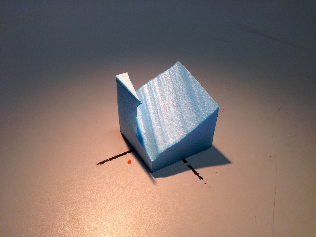
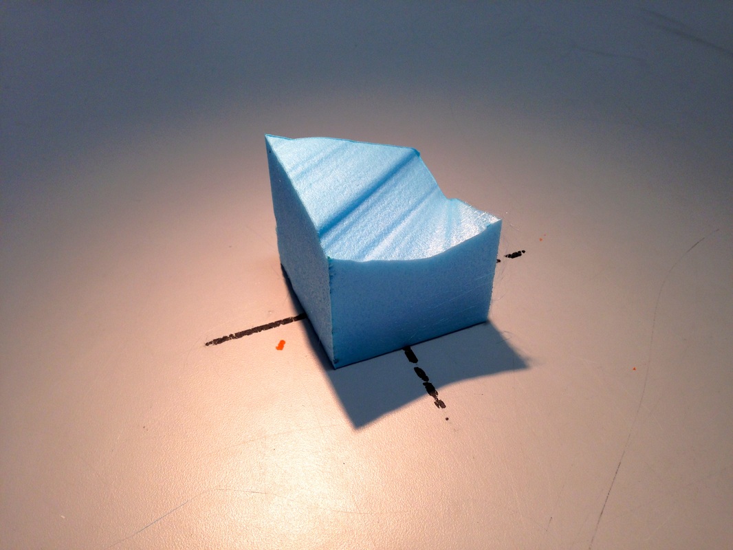
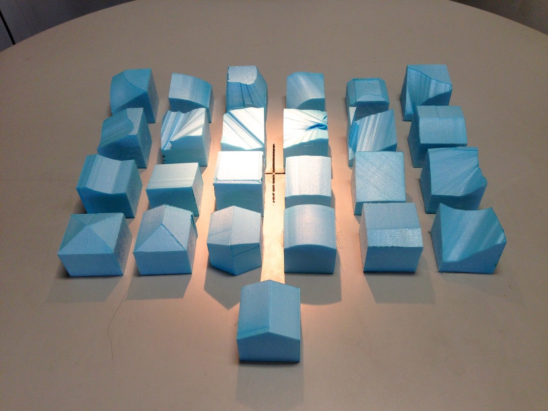
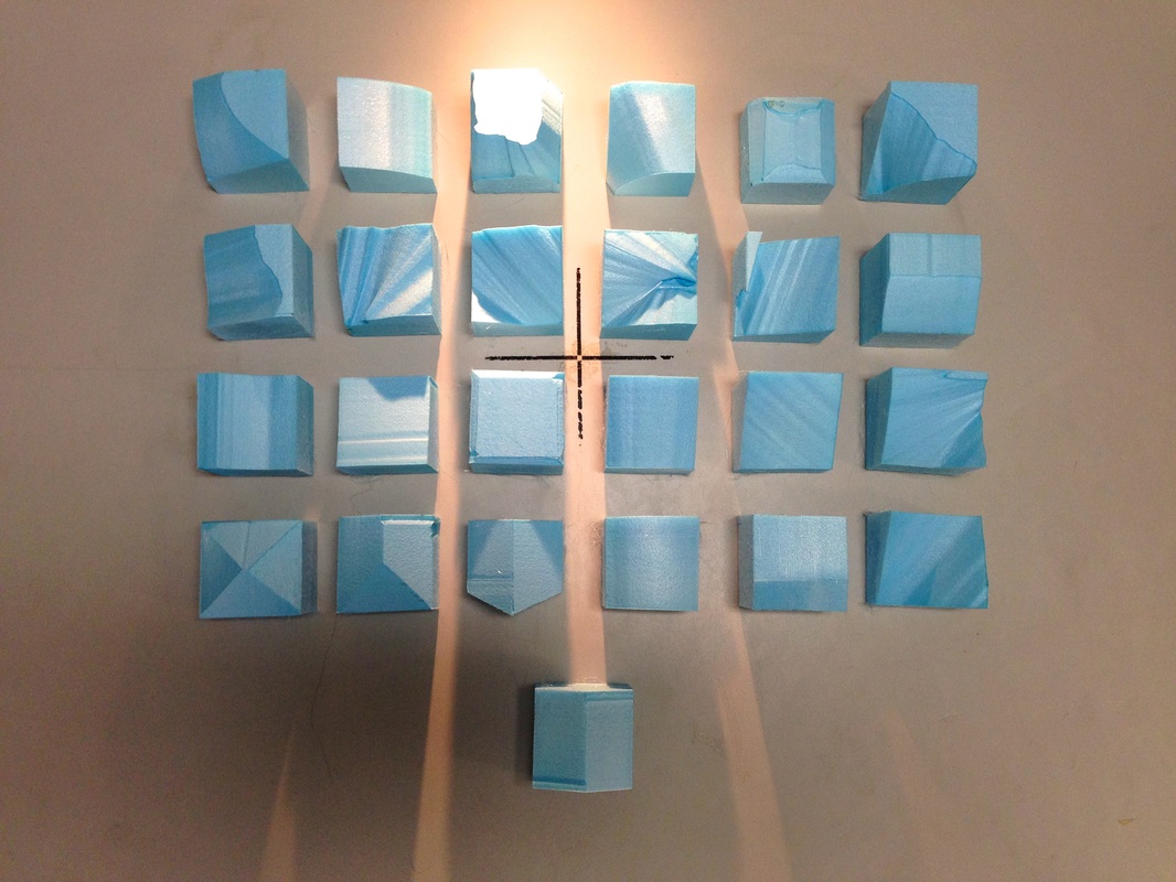
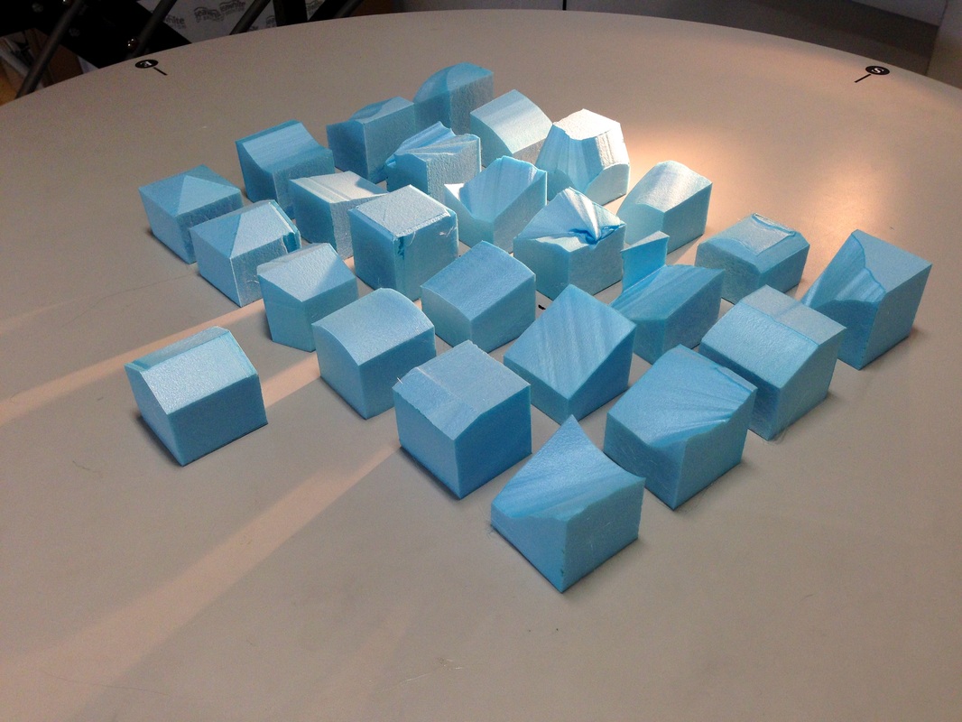
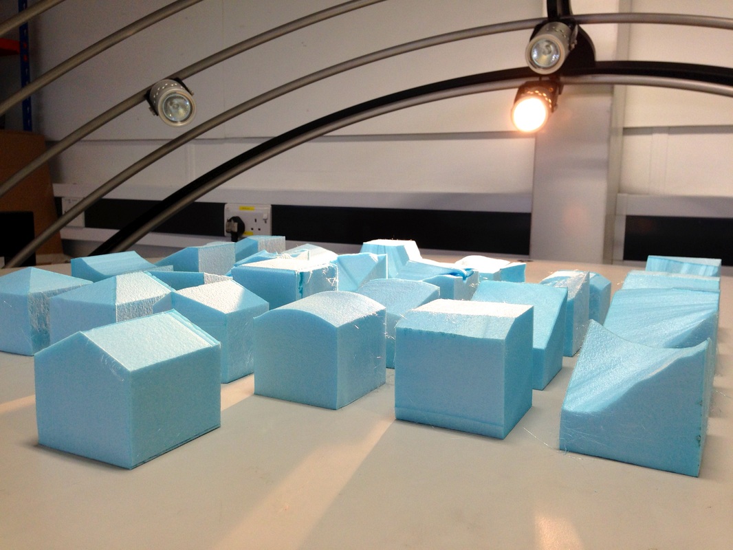
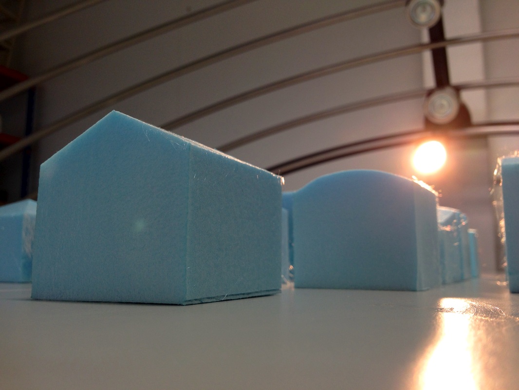
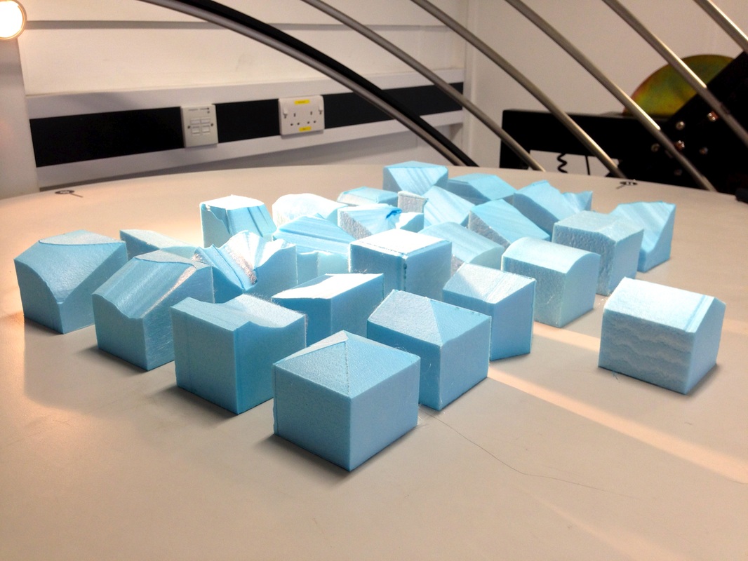
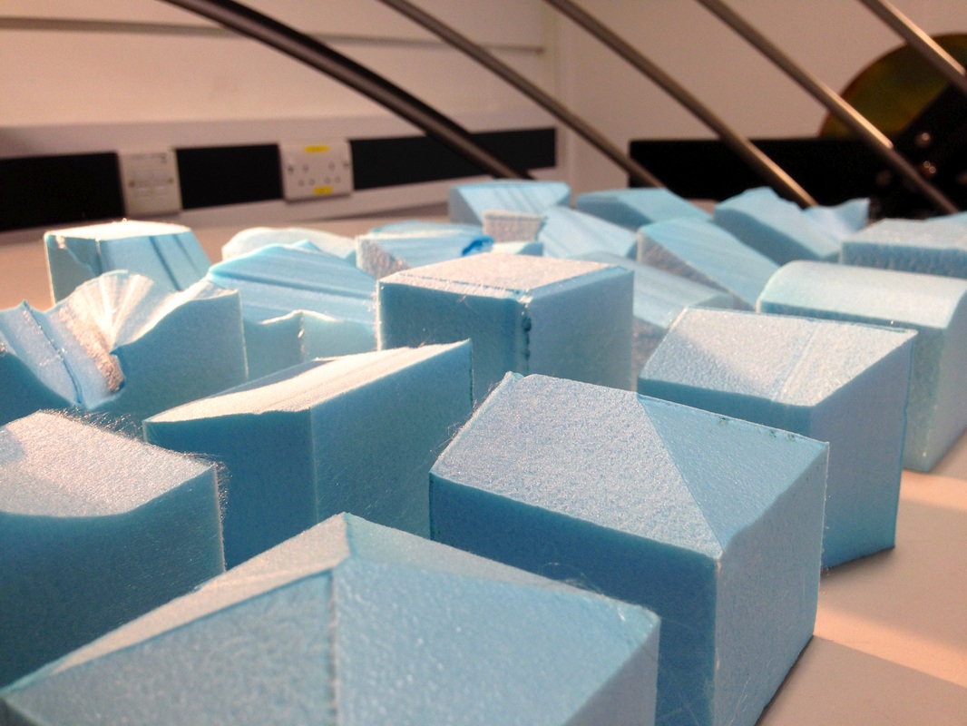
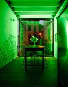
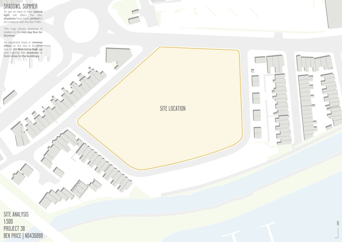
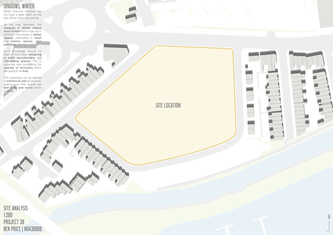
It is important to understand the context in which you are building. To help with this, a perimeter block model was constructed to examine how the spaces worked within the block and how the light would be effected by it. Because the project is early on, no one has a design yet and so every building was built to the highest it could be, 4 floors. This gives an idea of just how much light will be given to specific plots. This is especially useful given my site in the block is on the North. With the sunlight coming from the South, this presents very limited direct natural light. To make matters worse, I found out whilst experimenting with the perimeter block that my site gets very little light at all throughout the year. Midday in June accounts for the majority of natural light hitting my building through the year. Worse still is that the front facade only receives 50 minutes of sunlight per day, and this is only applicable in June. It is also split between the very early hours of the morning (before 6am) and the late hours of evening. This is also not factoring in any broader context. With the wider context included, it is likely the front of my building shall receive no direct sunlight at all throughout the year. 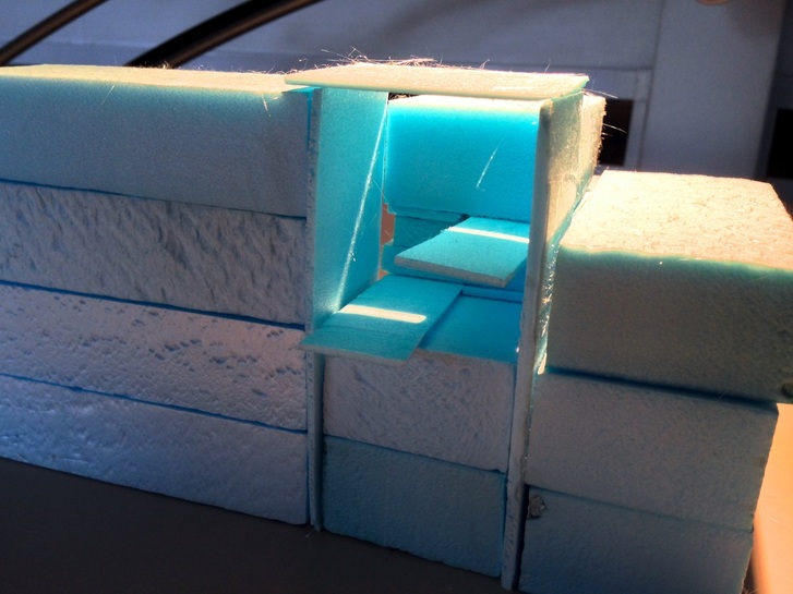 I love this design. The simple act of balancing a piece of blue foam on top of the two side walls created a whole new atmosphere. The way that the light works in it is fantastic and creates a beautiful glow from the foam, something which I would strive to emulate in the real design. I am also very interested in the shaft of light which enters the space. This is the design I feel passionate about to investigate further.
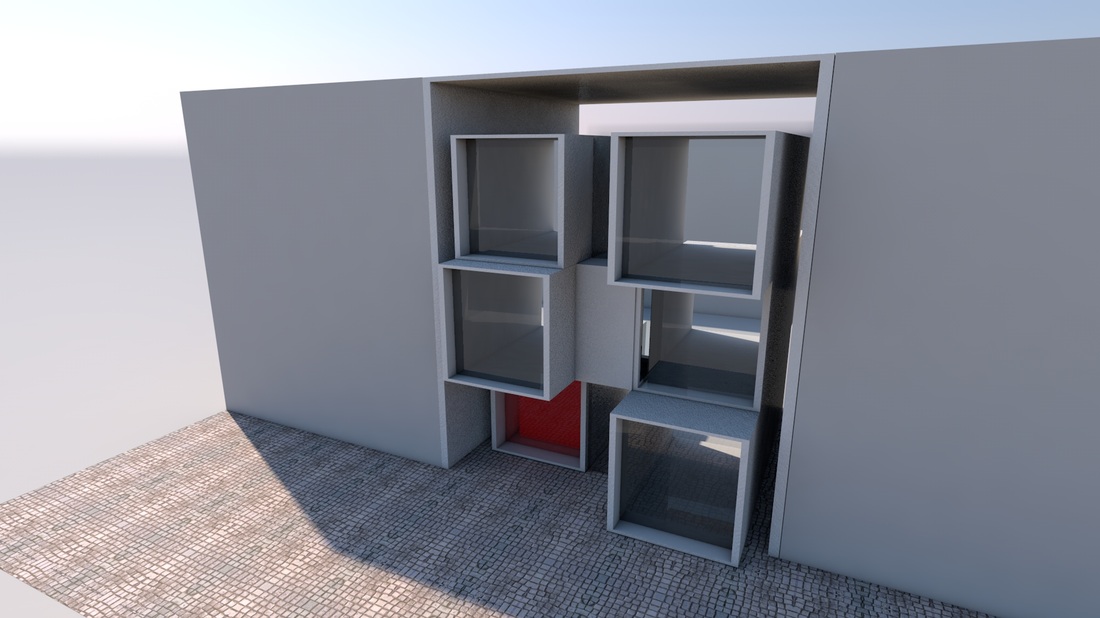
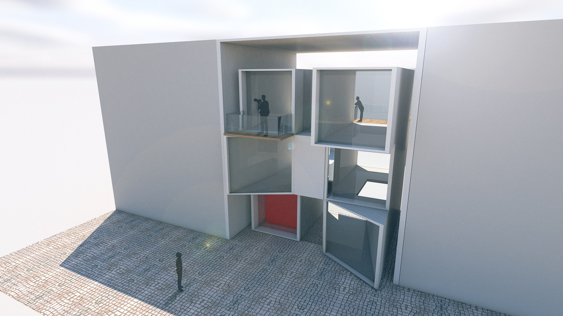
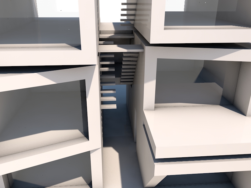
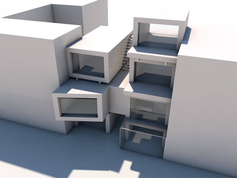
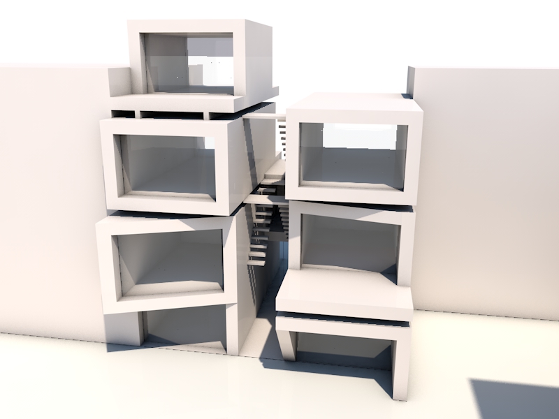
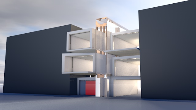
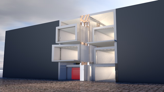
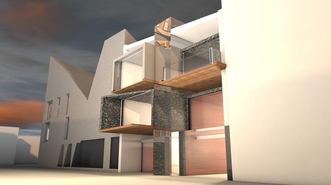
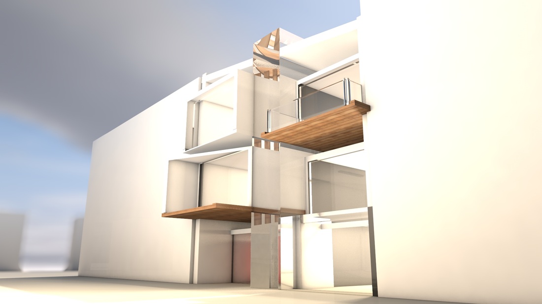
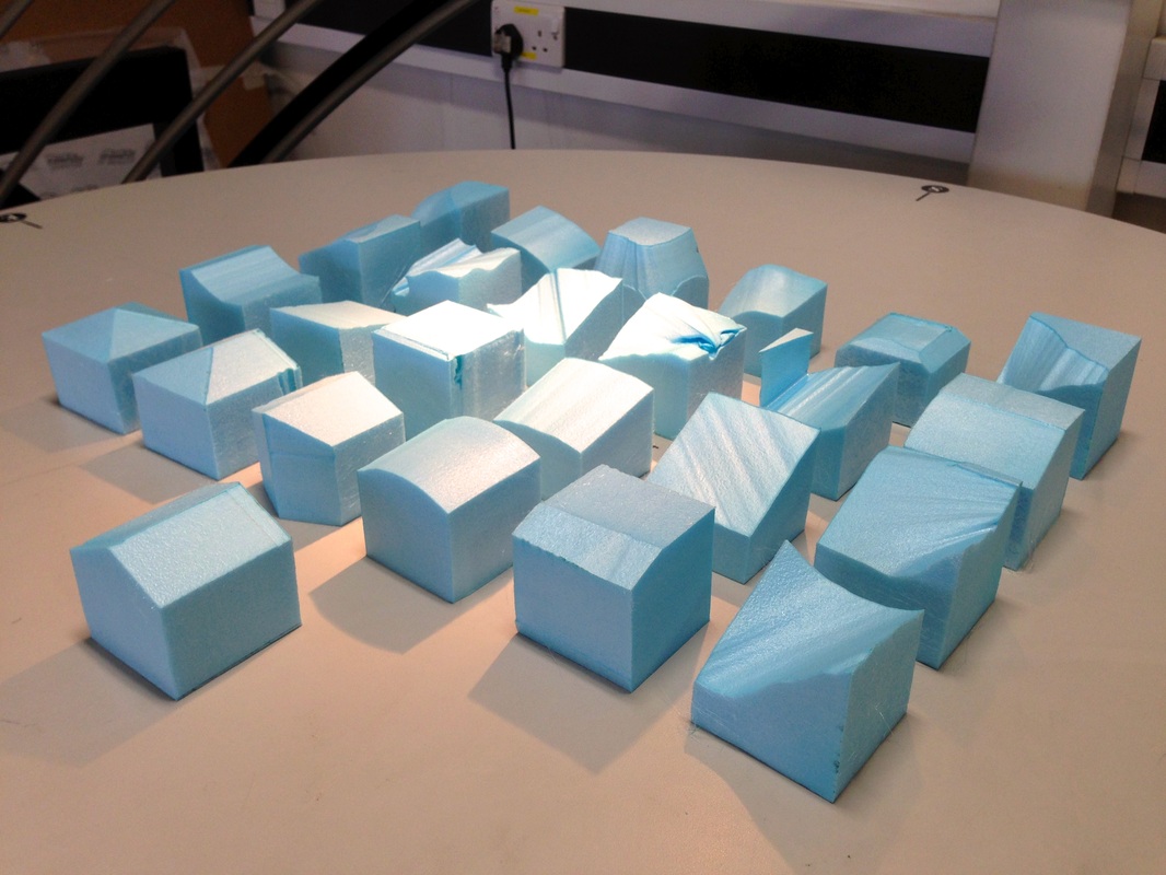
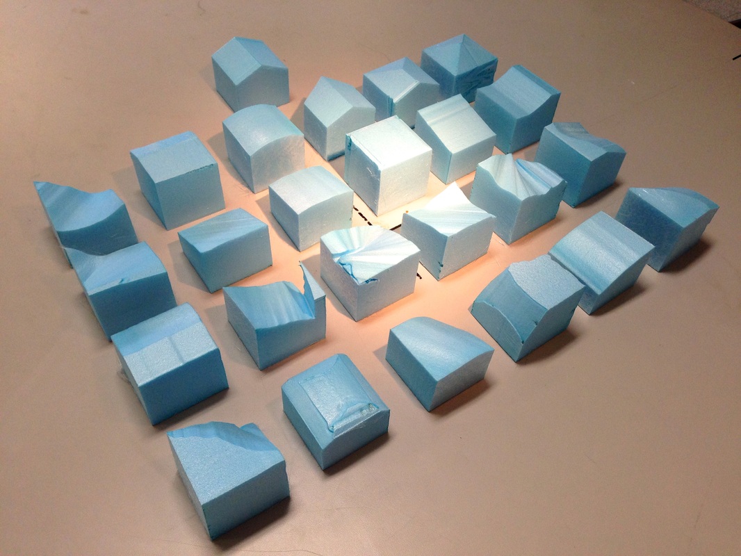
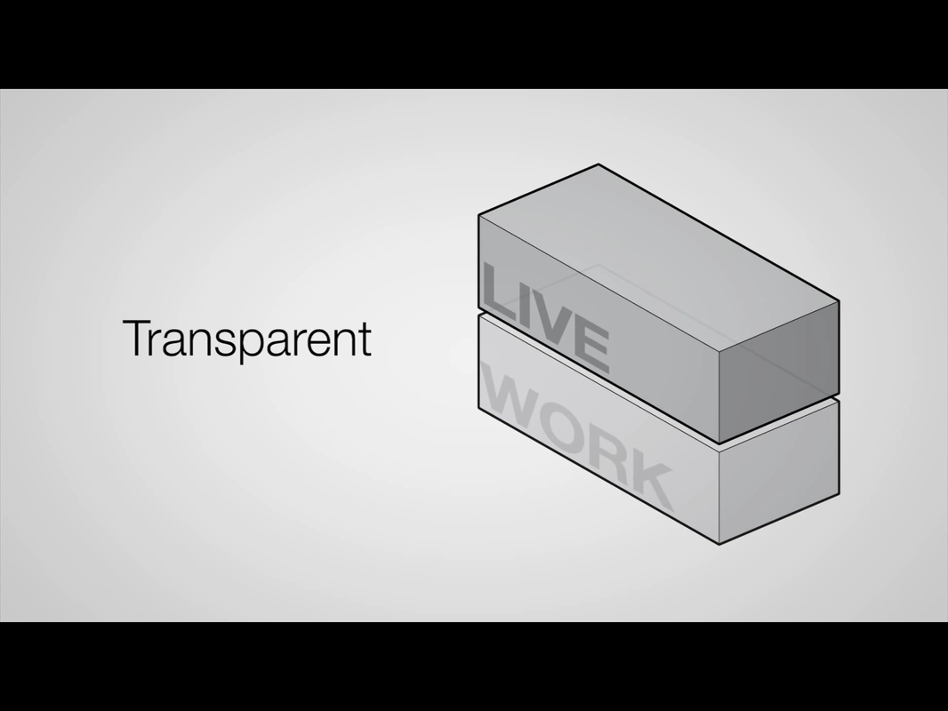
Taking the massing forwards, I have experimented with more shapes for my design, looking at how they interact with light at different times of the day. Because my my live/ work typology is split between two clients, I thought it might interesting to split the site in half and see what a 6m x 12m design might look like. The shadows created will be similar if not the same to the full 12m x 12m, but this way I could get a better grasp quick and individual shapes, as well as whether or not I was interested in making two sections for my two separate clients. It would seem that using 6m x 12m provides plenty of options and space for designing a live/ work space for a client. This presents the opportunity to create individual dwellings for my two clients, as well as merge, combine and intertwine them to create something unified out of two buildings.
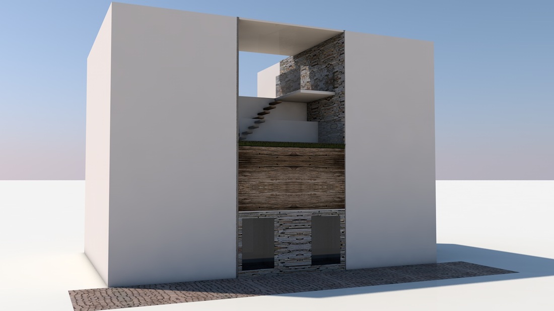
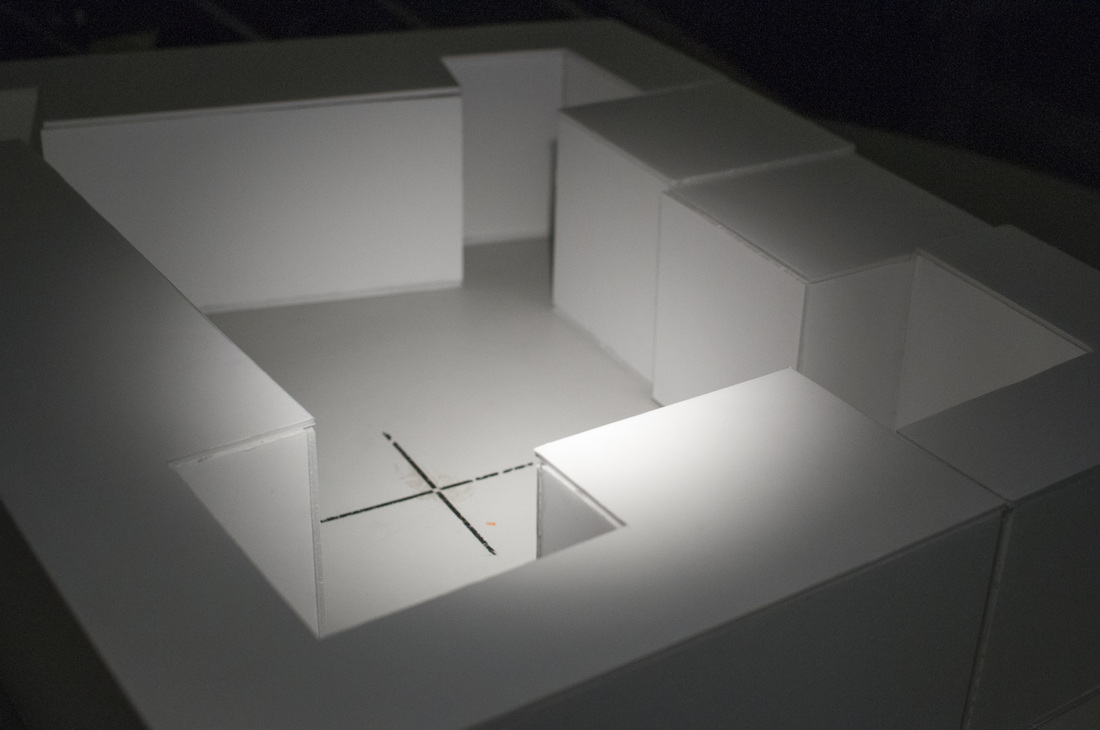
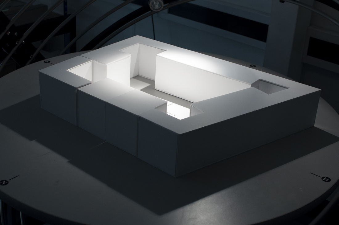
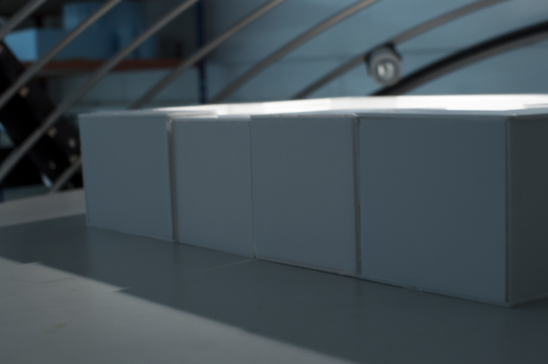
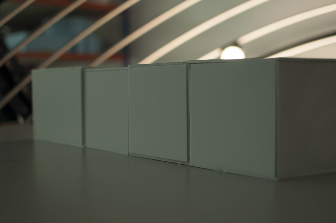
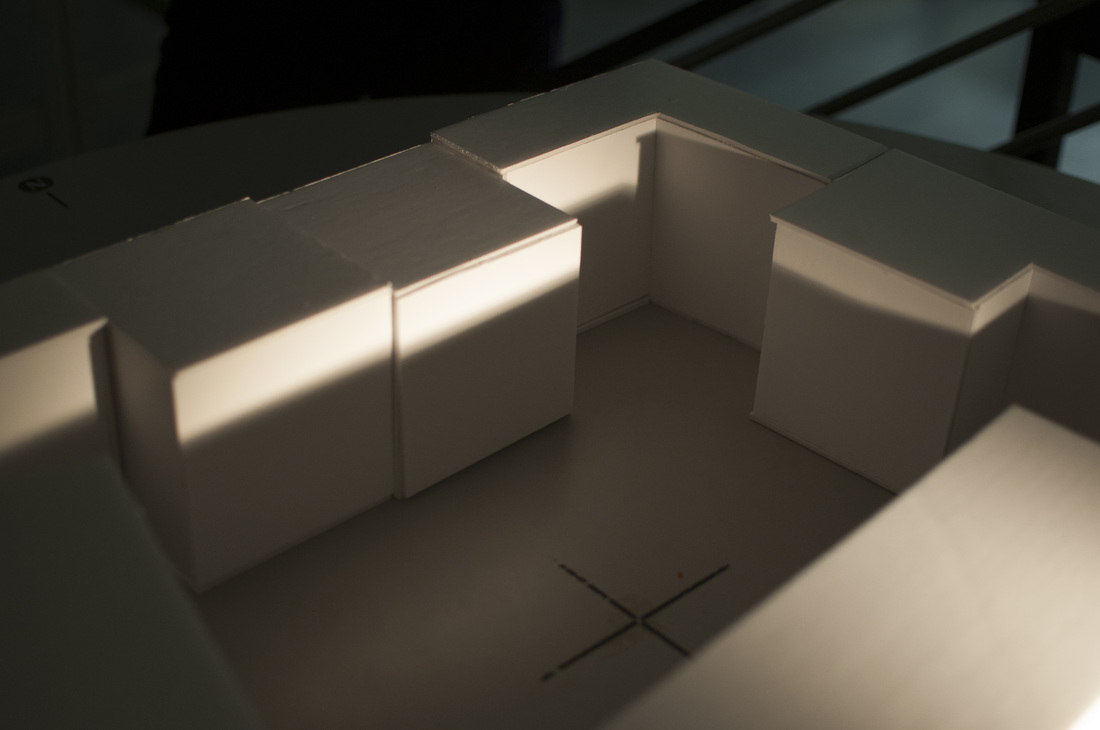
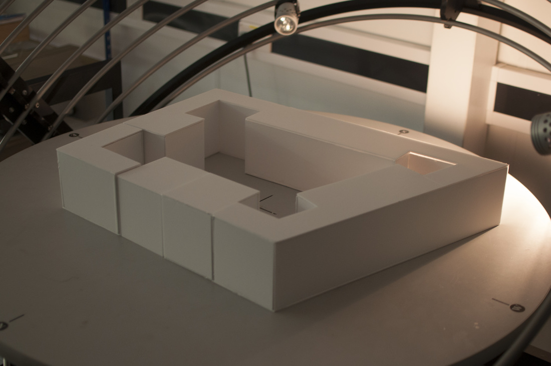
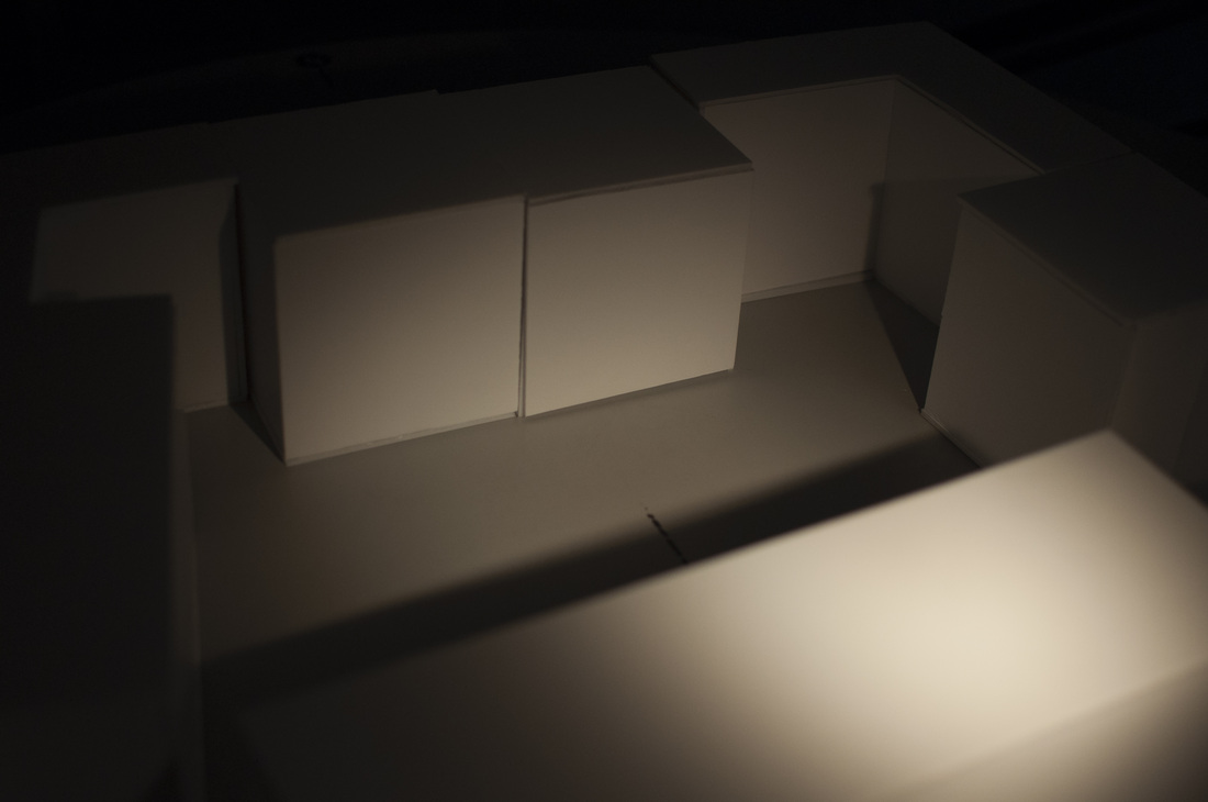
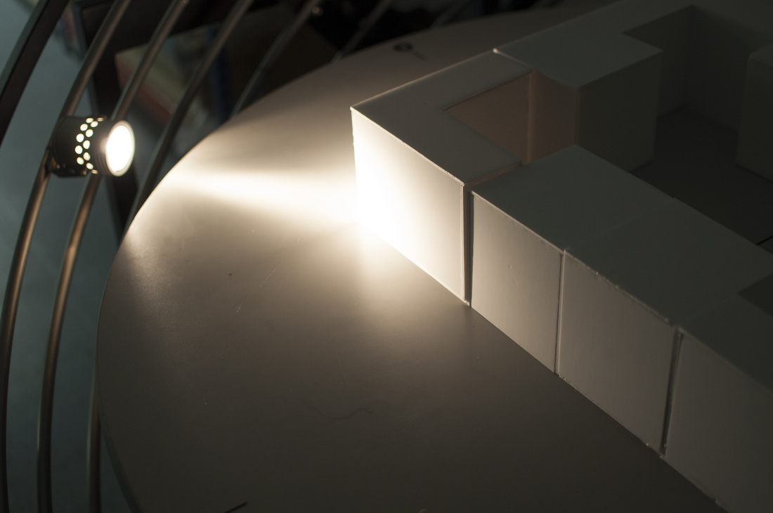
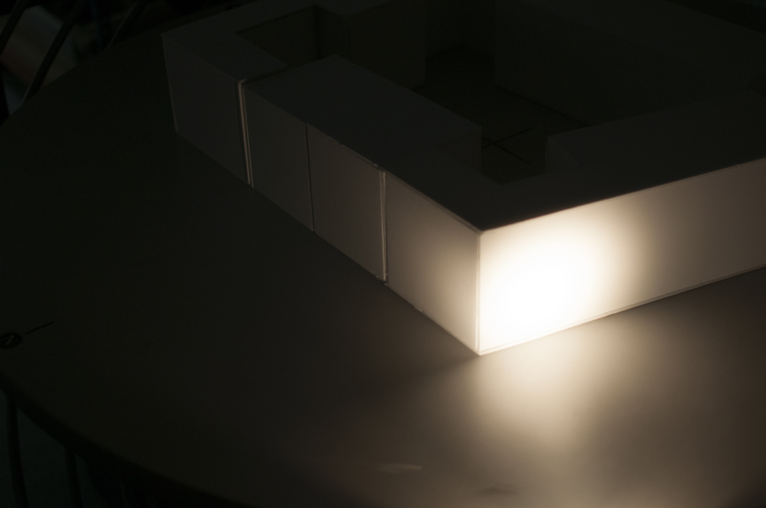
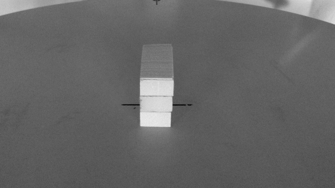
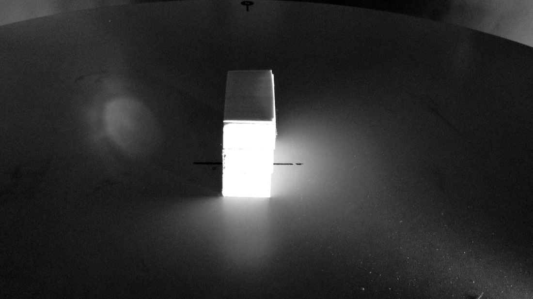
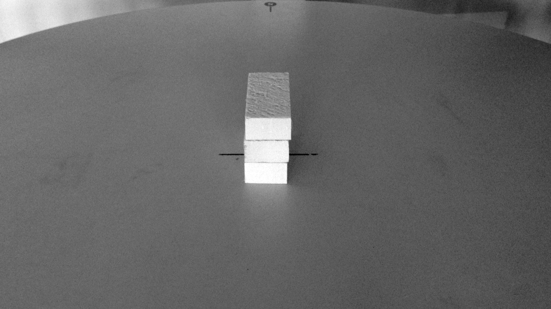
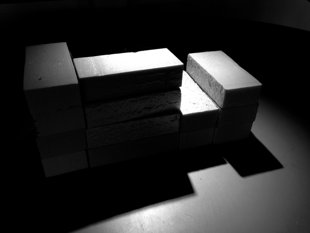
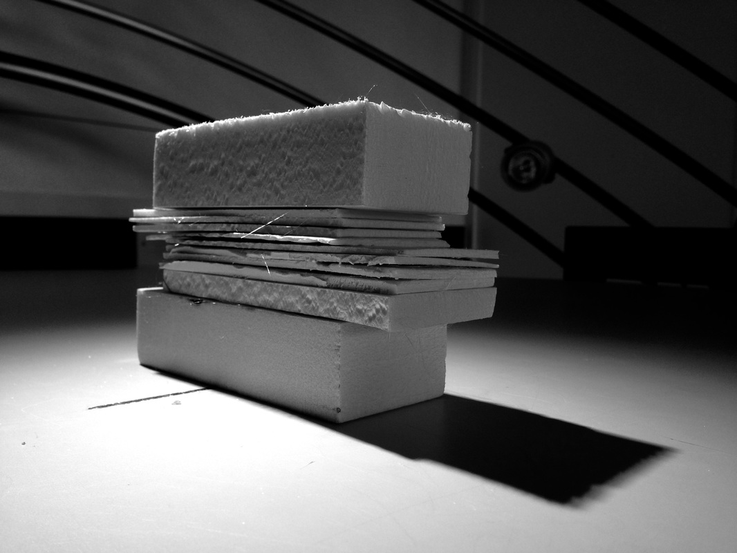
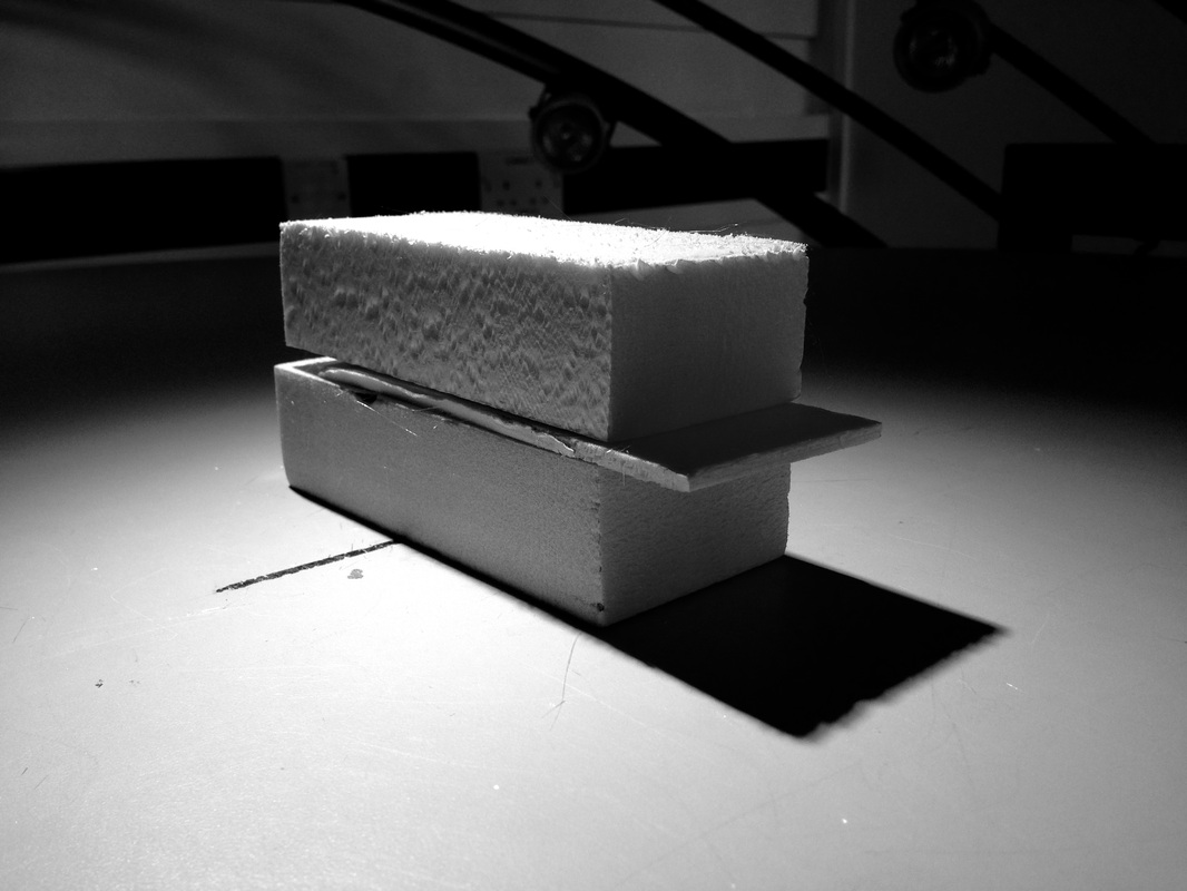
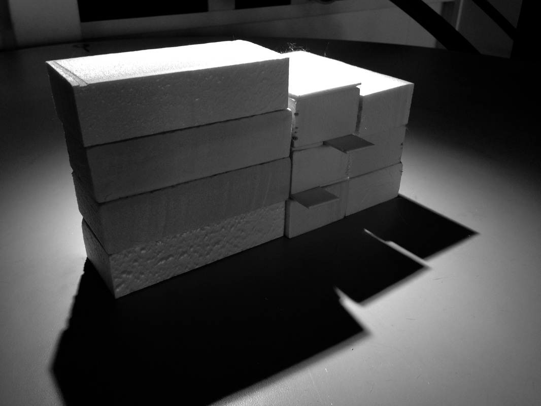
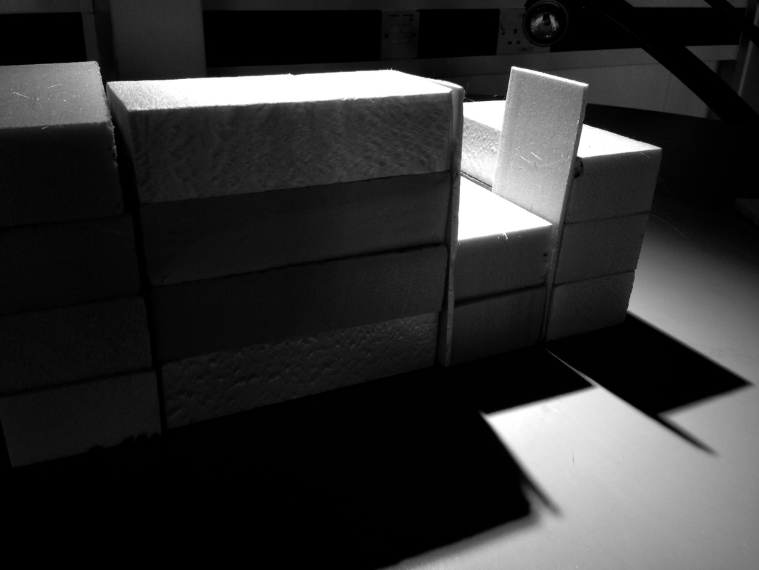
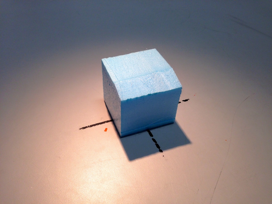
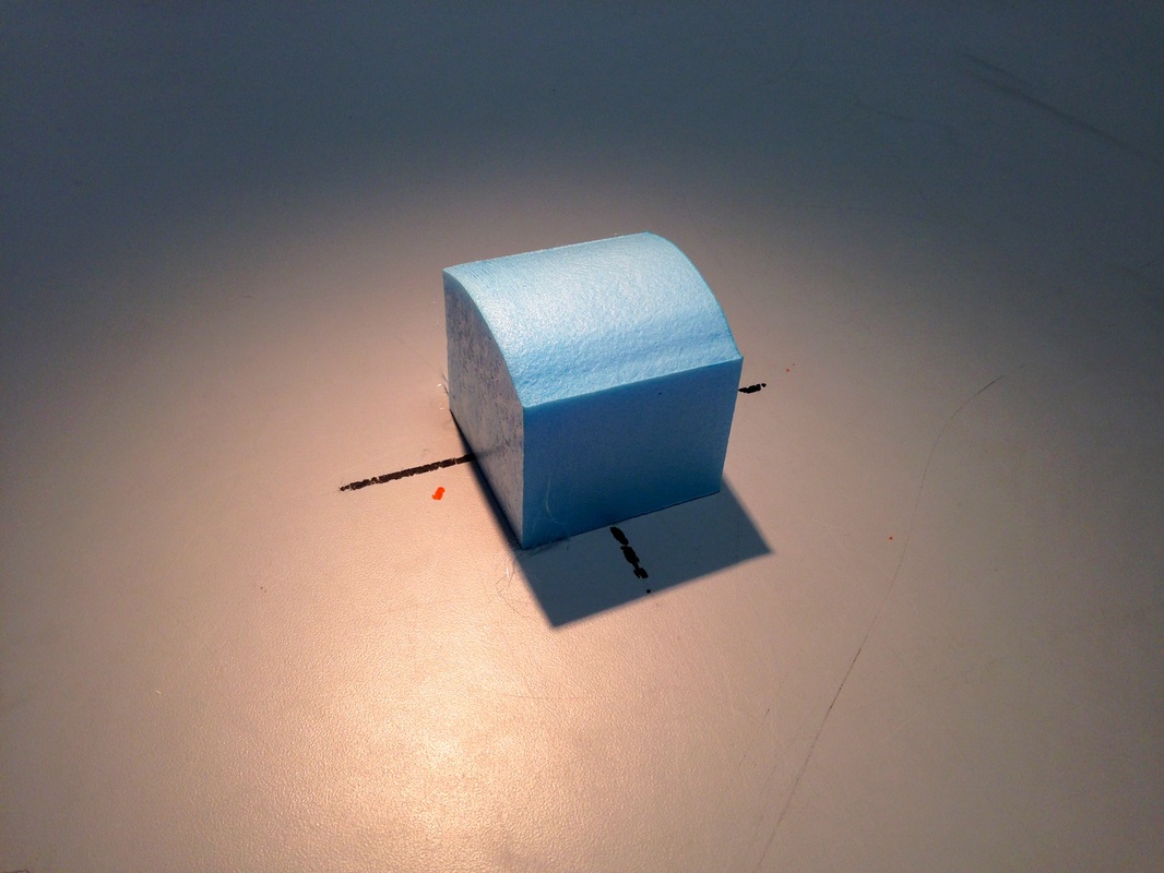
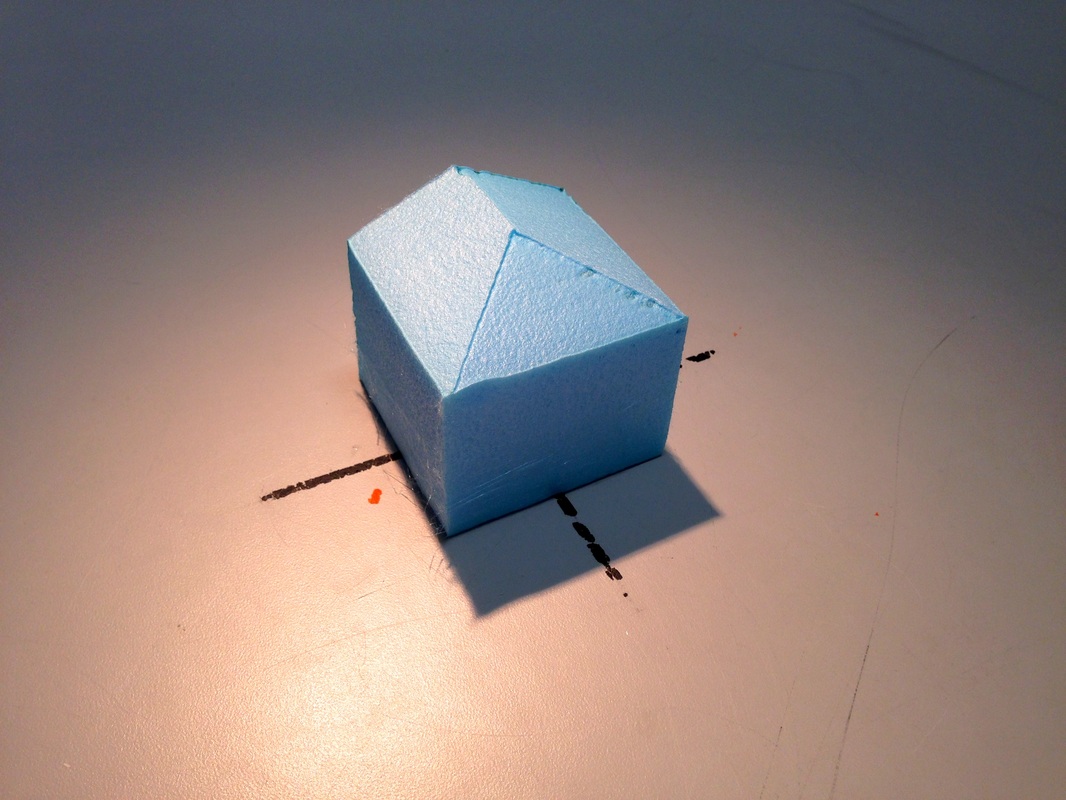
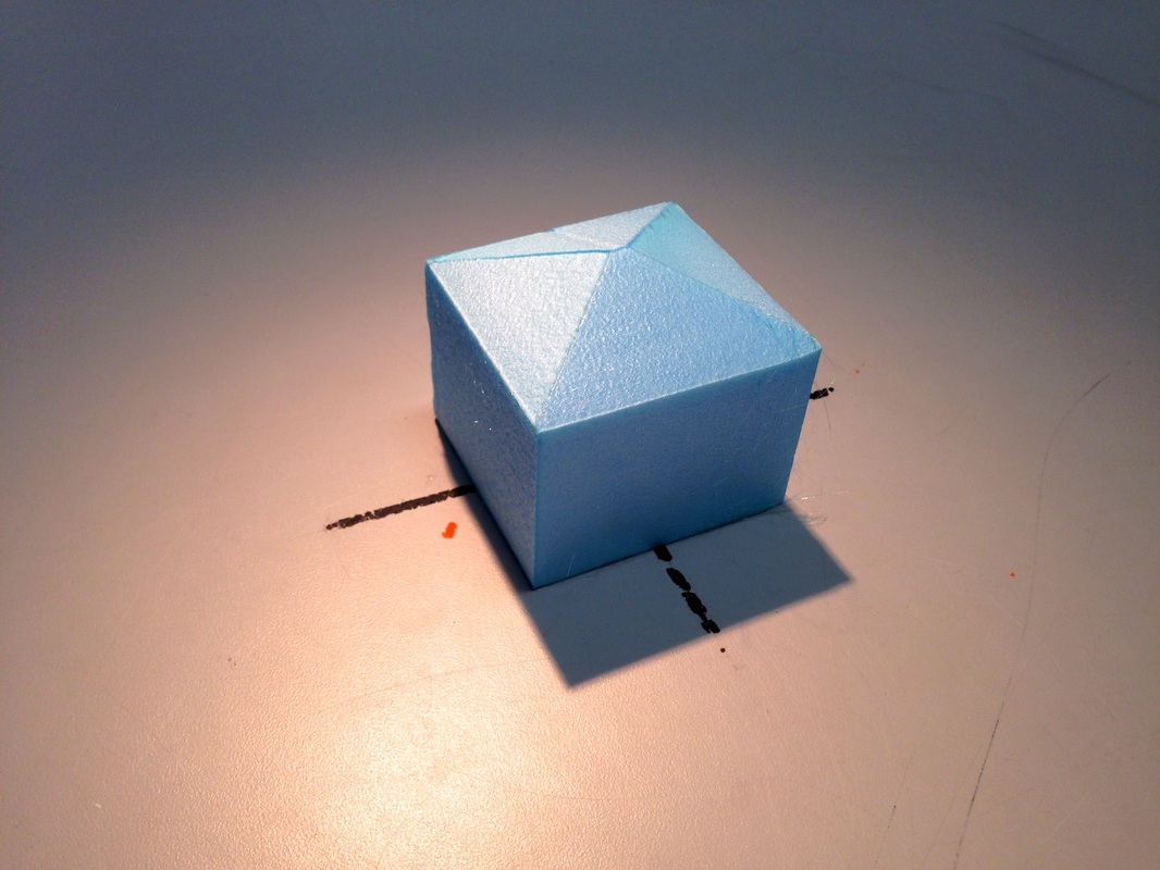
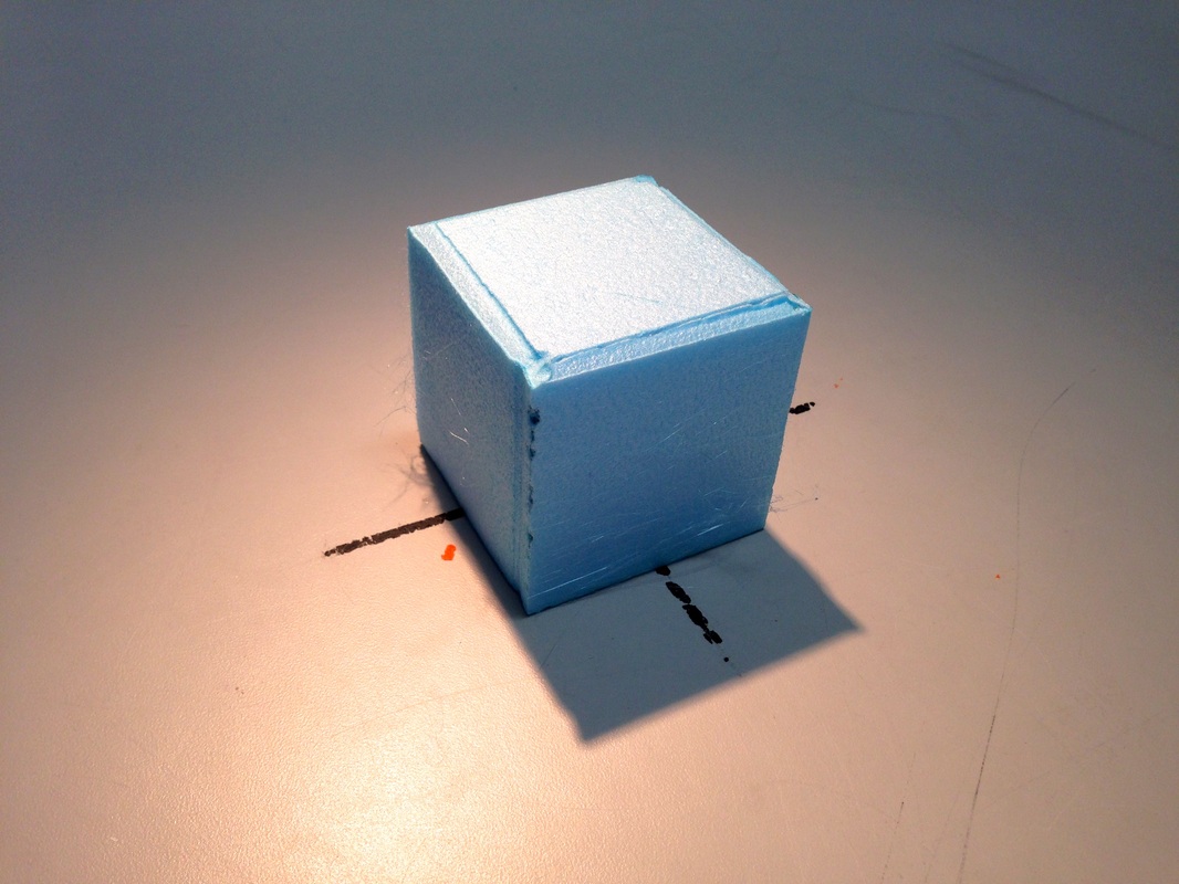
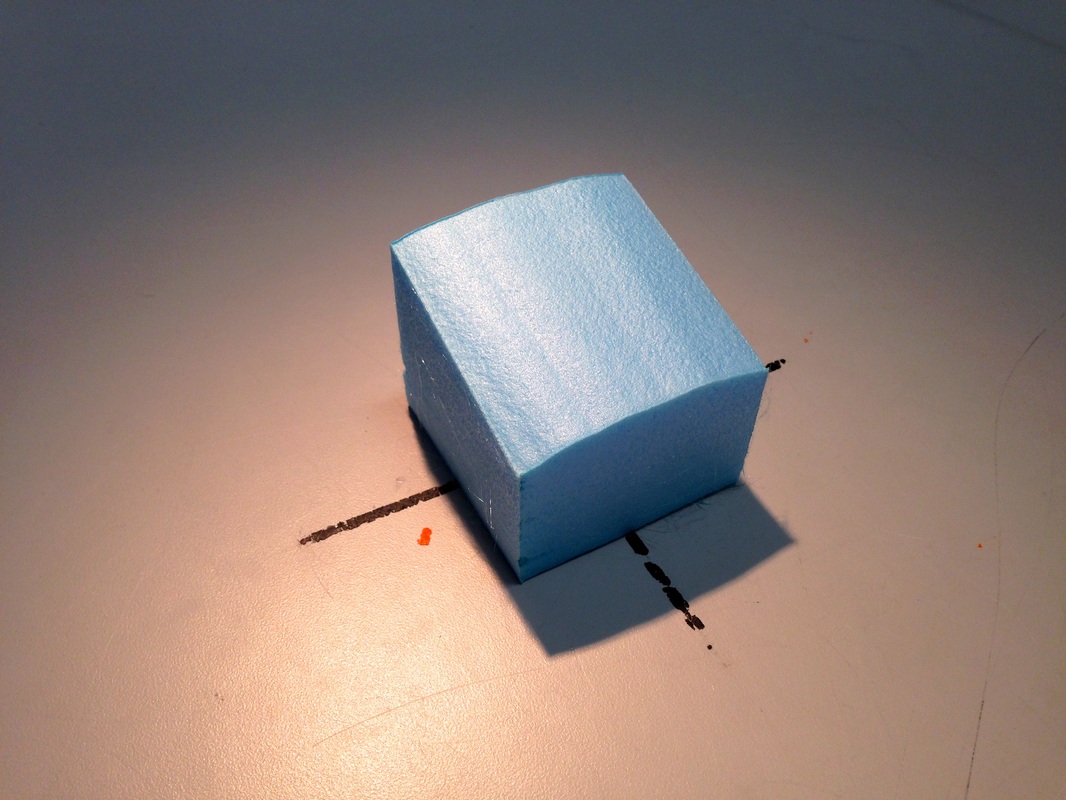
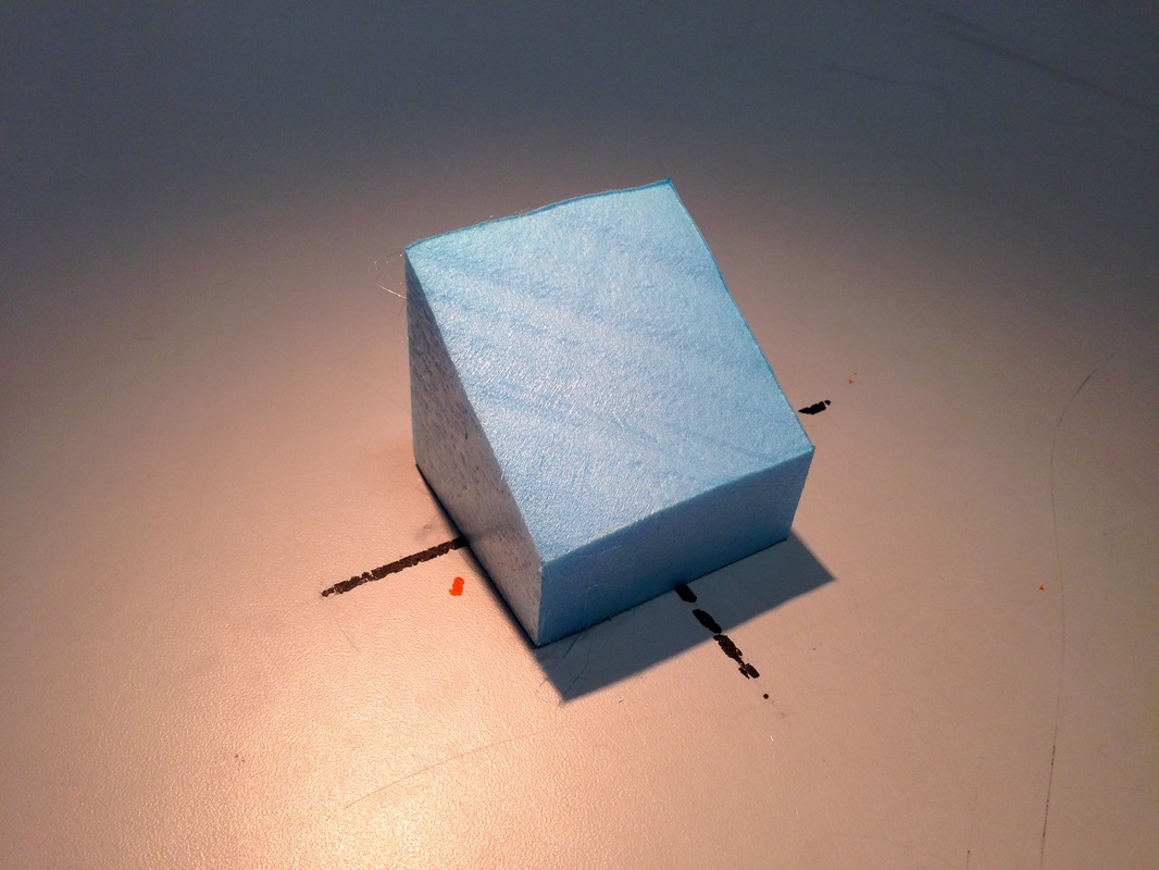
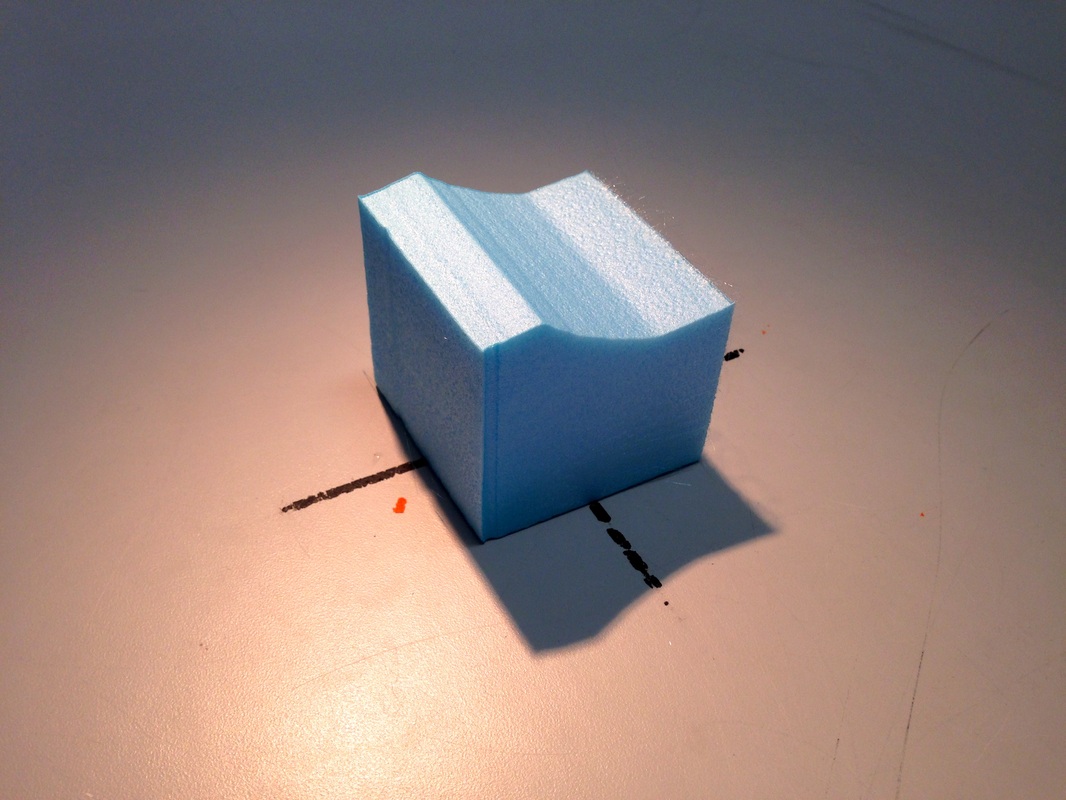
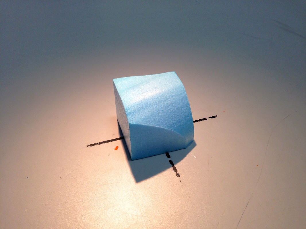
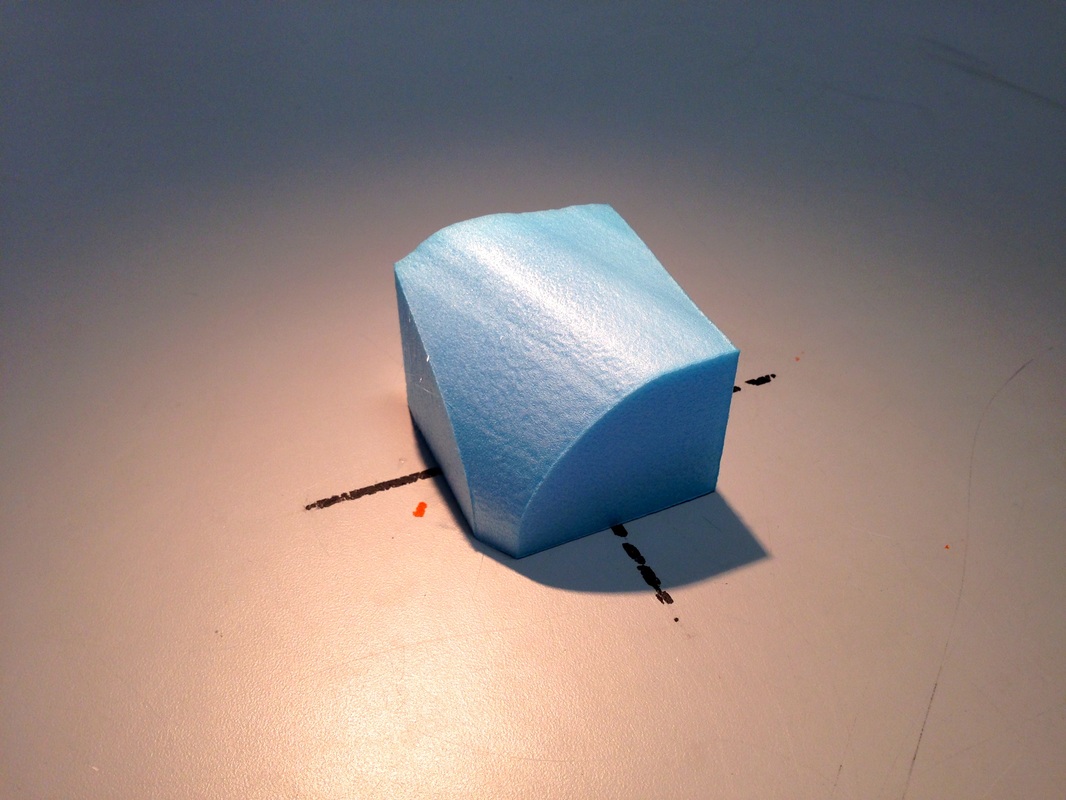
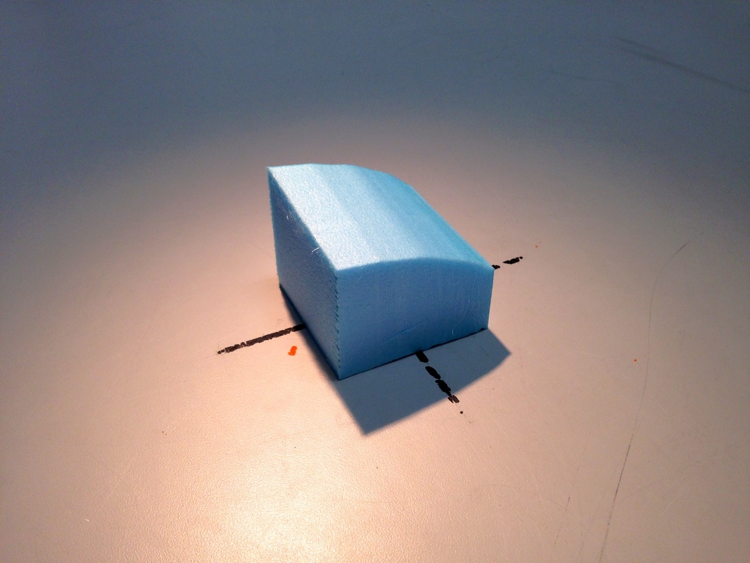
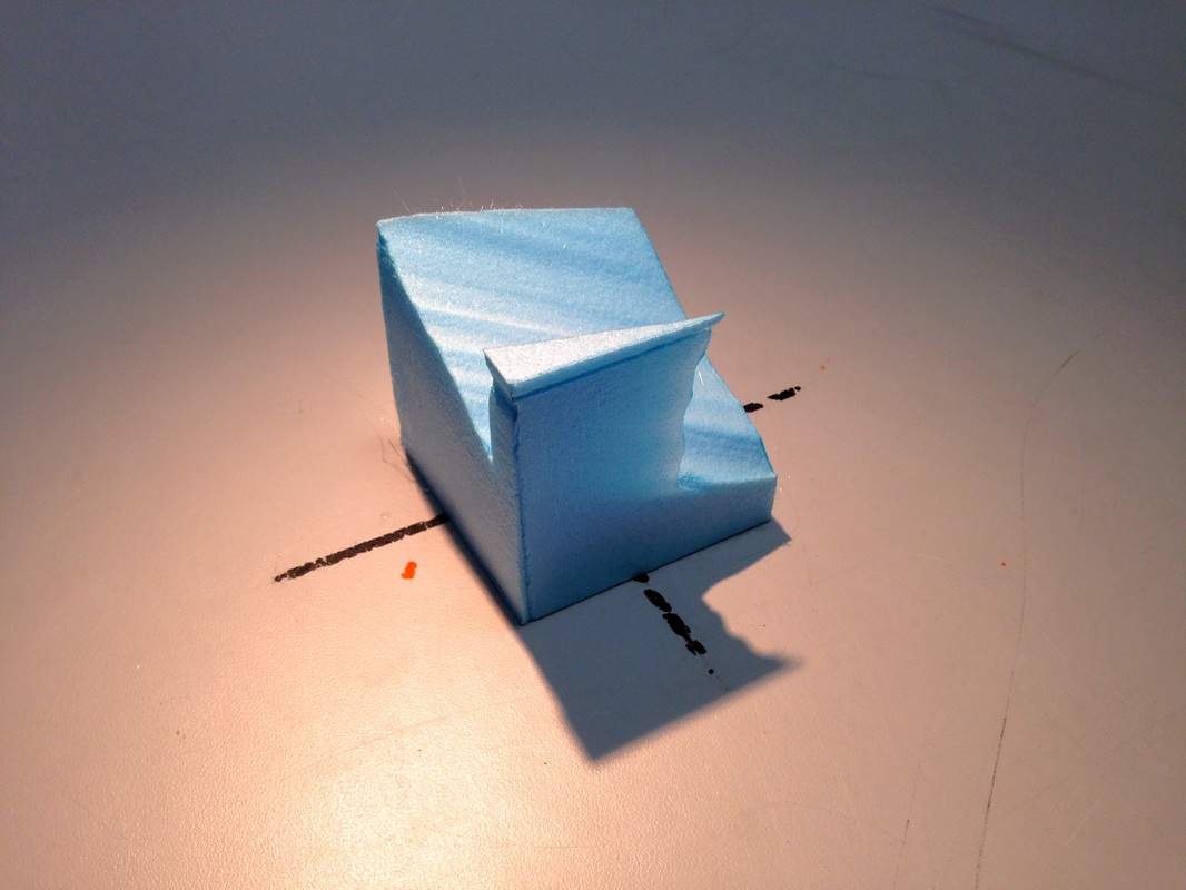
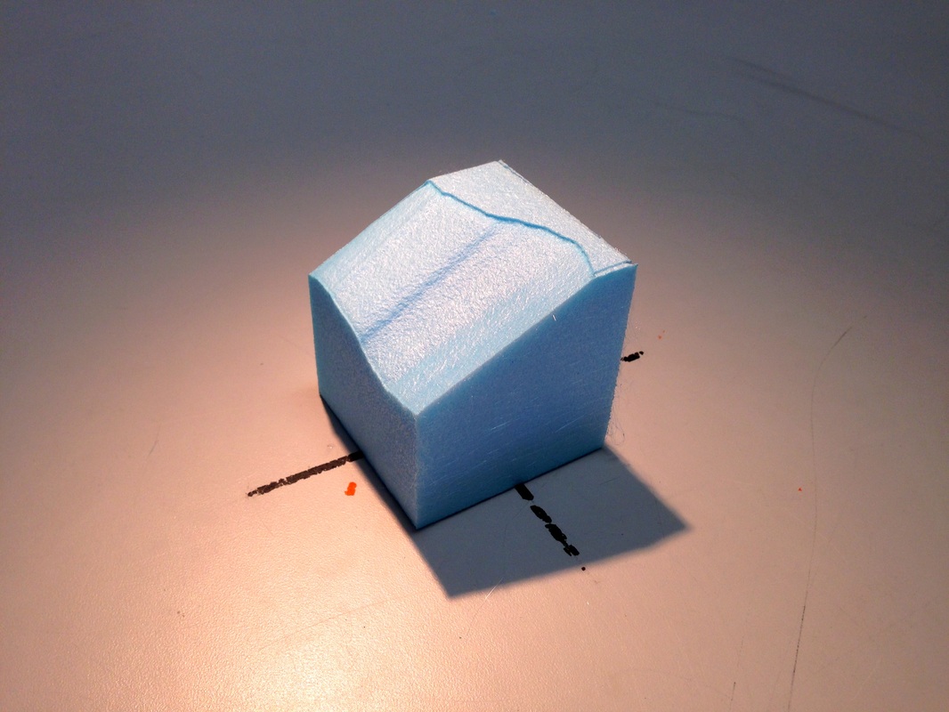
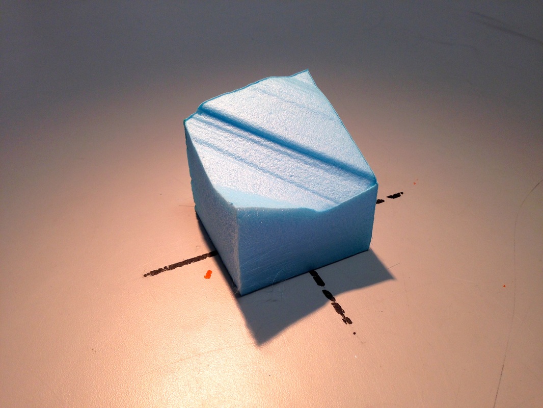
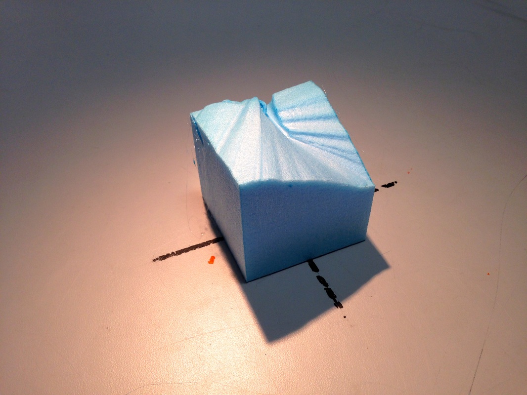
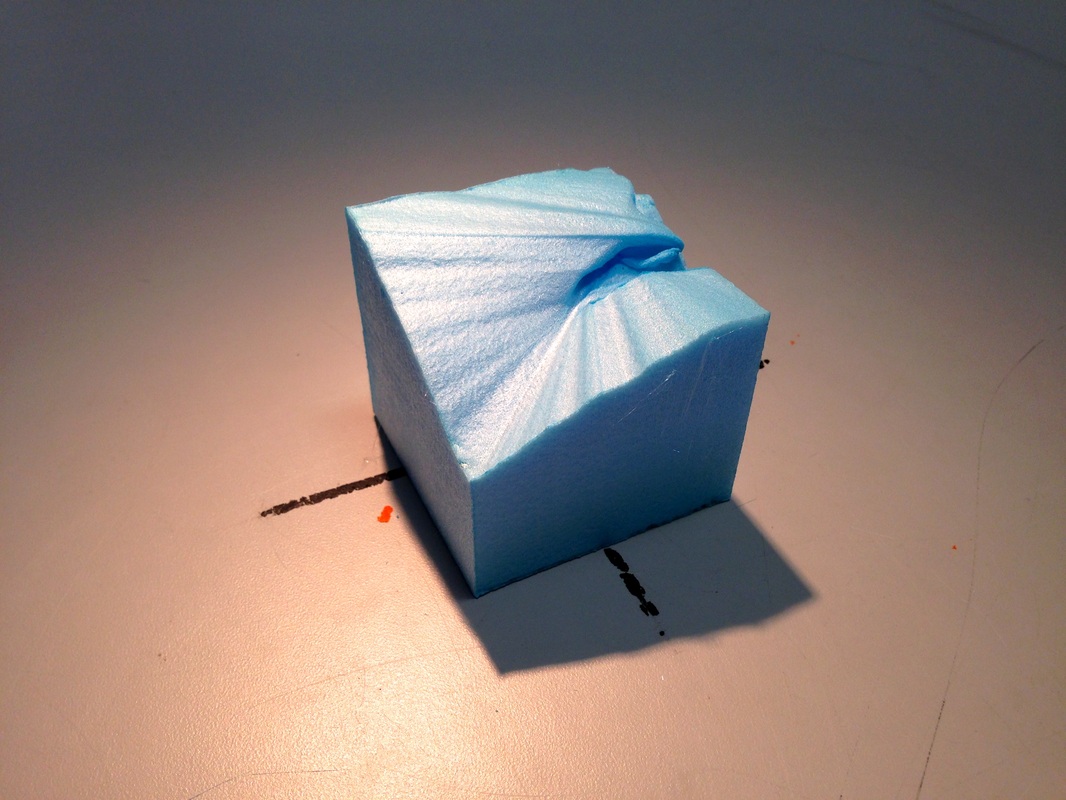
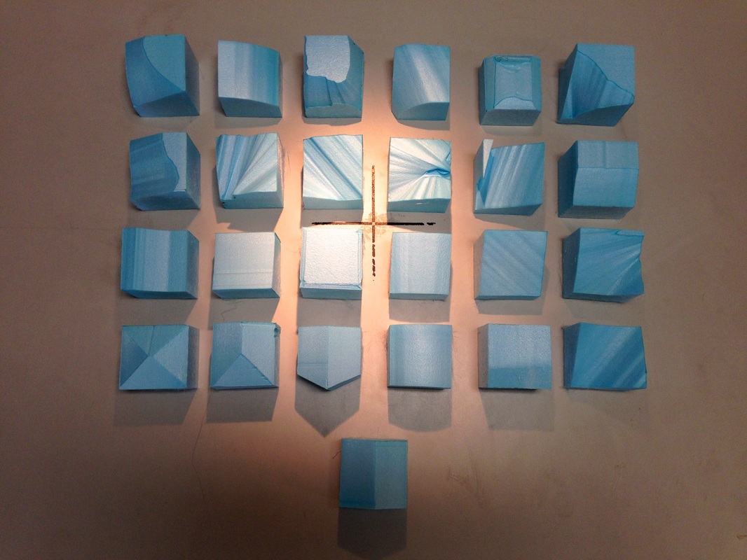
I spent a lot of time making some massing models to experiment with form for my 12m x 12m plot. Photos of the experiments can be seen below. 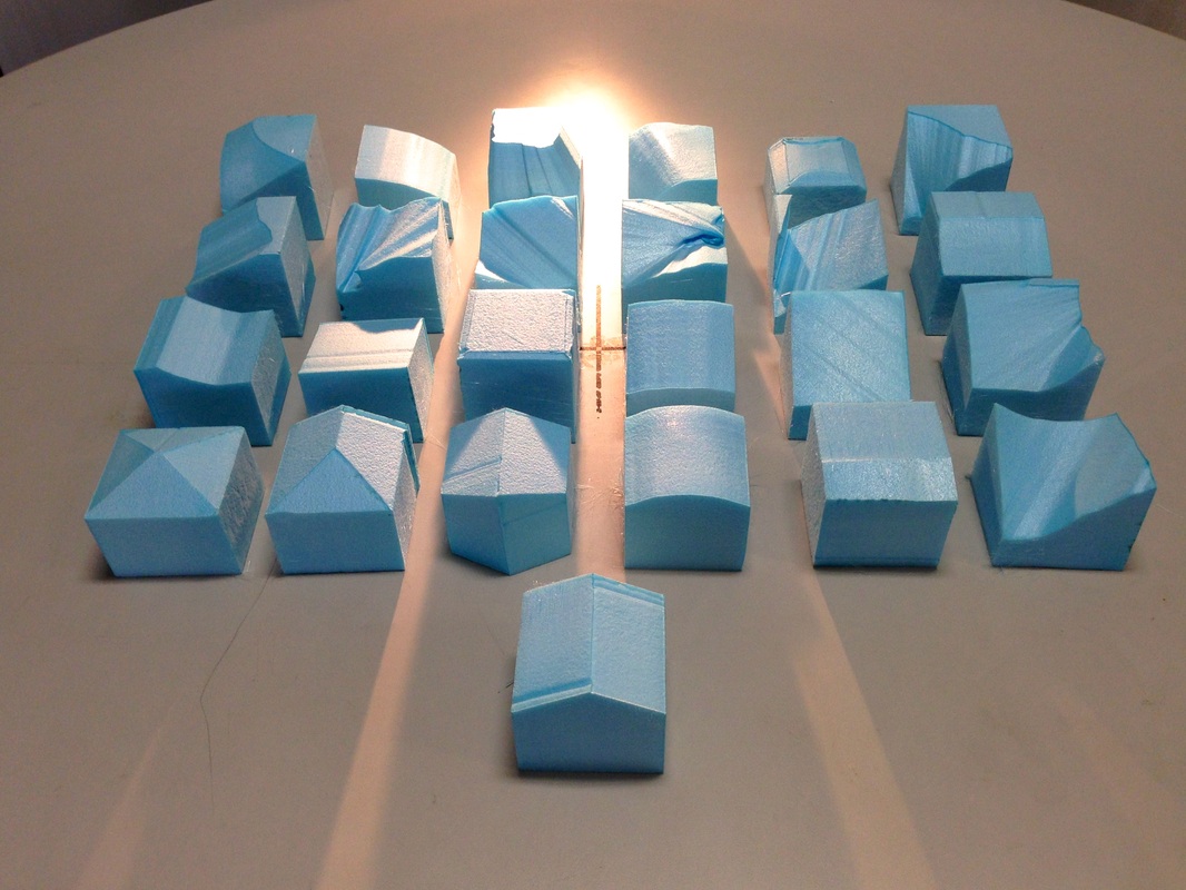 The following photos are of the models put together to form them some context and see the group together. The photos were taken on the heliodon set to Summer at 12 then Winter at 12. The difference can be seen very clearly in the shadows. It is important to bare this in mind when designing as, although the buildings will not be so close together, the site is situated in a perimeter block. This means that there will be buildings rising opposite it. There is also a perimeter block opposite too. Overall it is not expected that my site (on the North of the perimeter block) will receive much high quality light, so it will be very important to design in accordance with this. When a more detailed design starts to emerge, it will be worth taking a trip to the 'Artificial Sky' and seeing how the building reacts to more realistic UK natural light.
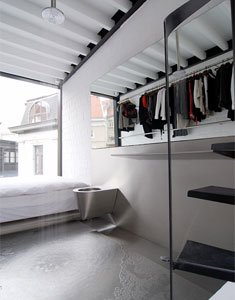
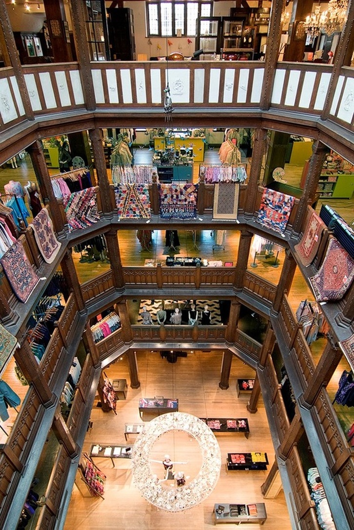 Historical Heritage In A Modern MetropolisSince 1875, Liberty London has stood has stood proud as a destination for high quality and innovative design. The Tudor building maintains a beautiful facade which sits in stark comparison to the context which has arisen around it. However, instead of modernising the interior of it as many buildings now do, this particular example has been kept historical throughout. The image above is of one of the most famous architectural elements of the Liberty interior, and it is exactly this which I have got in mind as inspiration for my design. One of clients is an established tailor, to have a space like this, even on a smaller scale, would be amazing to incorporate. I can imagine the tailor hearing his client walking through the door, then immediately running from his studio and excitedly greeting them from his grand balcony before inviting them up. It would also present opportunity for decoration and samples just as in the picture here too, noticing how the fabrics are folded over the balconies. 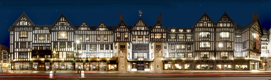 Returning to the exterior of the building, I do love that this beautiful building maintains the history of its build. Despite sitting in the London, an ever changing city, Liberty has kept hold of its identity and become an icon. It is definitely worth considering the context of the site when designing, although the industrial roots of the site may not be quite as intricate as the Tudor facades, there is certainly inspiration to be found. www.gardenista.com/posts/shoppers-diary-liberty-of-londons-floral-fabrics
www.londontown.com/LondonInformation/Shopping/Libertys/851c/imagesPage/25972/ www.liberty.co.uk/AboutLiberty/article/fcp-content 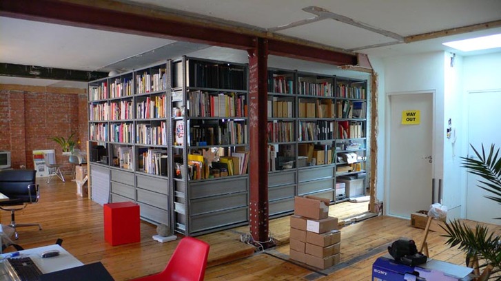
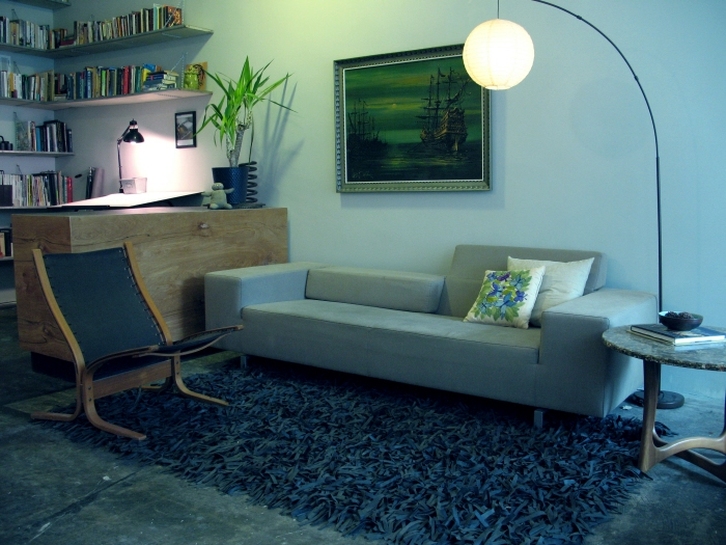
From Industry To ArtSet in a converted industrial building, this studio/ home is a larger example of an open plan solution to a live/ work space. The aim of this design was not just to fit the purposes of the current requirements, but also to provide for any future needs. This helped to inform the designs informal approach to atmosphere. 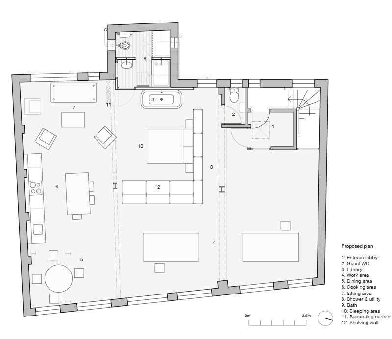
This usefully labelled plan guides you through the open space. This too is the case in real life as the space itself leads you through from part to the next. The designers say "The different functions are arranged in order of privacy around the space, with the entrance opening into the studio work area, through the library, dining, kitchen & sitting areas; culminating with the bedroom & washroom." It makes clever use of industrial shelving in an 'L' formation to separate the live space from the work space, along with full height curtain. As can be seen, there is still evidence of the industrial history of the building in the steel columns. 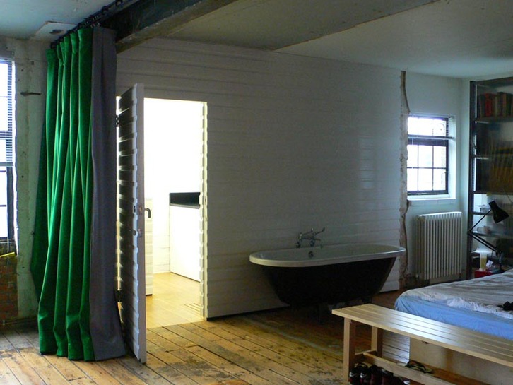
I like this precedent very much. The industrial feel works very well with the open plan idea and compliments the artist's studio usage. I think that it is key to lay out the spaces in an appropriate manner which guides the inhabitants through it, linking one to the next fluidly, much like in this example. www.simonjonesstudio.co.uk/live-work-space-london-e2/
An Urban Storefront With A New Approach To Business.This precedent a very useful one to look at as it takes an old urban storefront and repurposes it for a live/ work space. The studio is placed in what would have been the front of the store and features the same shape that it had as a functioning store. 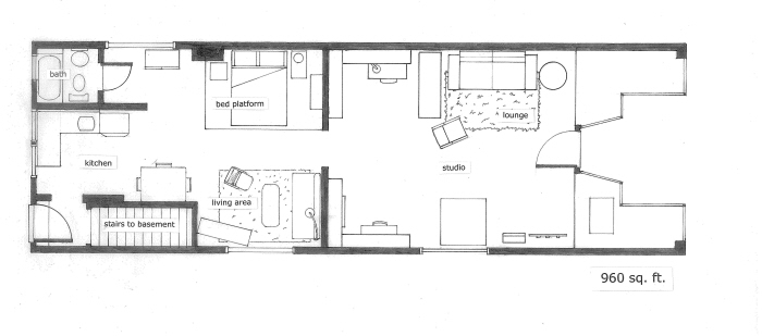
The layout of the space is similar to the previous example in that it creates a separation between live and work. The difference is that design is contained to one floor, as opposed to many. It has only one wall dividing the living space from the vision of the public passing by the studio, but it is sufficient enough to provide privacy. Apart from this wall, everything is very open plan. 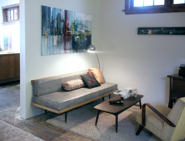
www.coroflot.com/davidmburnett/avdevad-livework-space
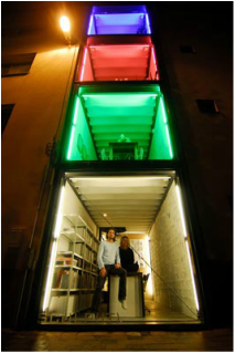
 A Compact Solution To Combined Living.This interesting example of a live/ work dwelling was designed by architects Pieter Peerlings and Silvia Mertens, who also happen to be its inhabitants. As such, the confined spaces have to accommodate the daily lives and work of two architects. The space is modest, measuring a mere 2.4 meters in width, 5.5 meters in depth and a total of 12 meters in height. 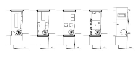 The building has been divided into 4 floors, with a garden on the roof. Each floor is assigned a purpose, with the ground floor designed for working, the first floor laid out for dining and the second floor and roof garden for relaxing. This layout is a logical one for them. They are able to meet their clients on the ground floor without taking them through their home. Having the dining area directly above the studio provides quick access to the most commonly required functions of the house, access to food and water. 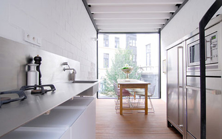 The part of the house which I take issue with is that of the 'Bathroom'. This may have been a design decision which was necessary for them as people, but it is certainly not the most elegant of solutions. Instead of having an actual bathroom, the components are instead spread out amongst the open plan interior of the other floors.
Although the building's design may have issues with privacy, it is clearly designed with personality. It was designed by the people that live in it specifically for them. This is perhaps key to this project. My client/s will require a building that works for them and responds to their needs and personalities, not just a generic box, but a personalised form. www.coolboom.net/architecture/livework-space-by-sculpit/
www.madeofboxes.pl/?live-work-space,45
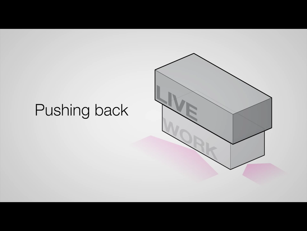
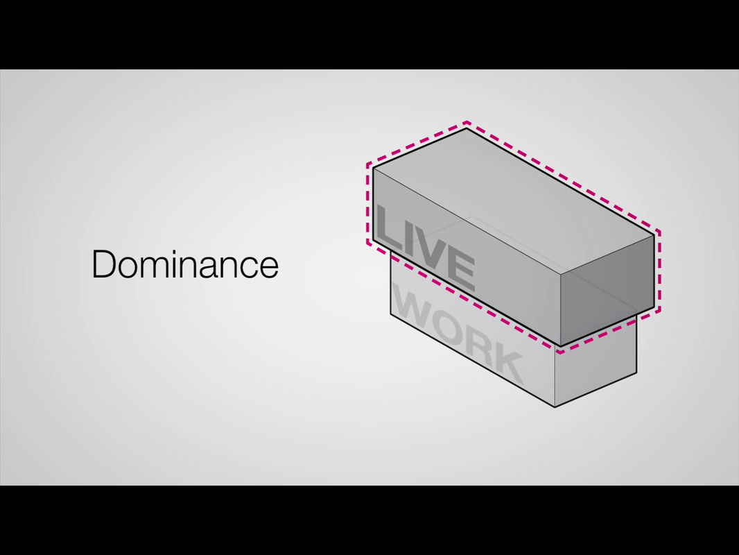
What is a live/ work space? What does a live/ work space require? To fully function as a building for both working and living, the space must accommodate both of these aspects appropriately. This doesn't just mean providing the right functions, but also the correct balance. Although there will always be exceptions, it is likely that the client will not want to be constantly reminded of their work/ their store whilst they are in the residential areas of the building. There must be good organisation through the building to allow distinction between the two elements, whilst creating an efficient use of the available space. A live/ work space must be have all the necessary functions for day to day living, everything a home would offer. This means a bedroom, bathroom, dining room, living room etc. However, this type of building needs to cater for other requirements too. Depending on the work of the client the needs may differ. However there must be facilities available from plumbing to electrics, there must be suitable light and comfortable conditions, and there must be space to work. It is important to remember that some people will choose a live/ work space to live in because it is more suitable that the small office they work in now. As such, the space for whoever lives there to be able to achieve their dream is important. Whilst researching the topic, I found an incredibly useful video by Eric Laine and Suzanne Steelman from Eric Laine's Youtube channel. The video can be found below: The focus for the 'LiveWork' project i the video above focuses a lot on sustainable design, it plays a major part in the live/ work concept. However this is not just because 'green living is good'. This was a conscious choice based off genuine fact. And the fact is this: If people are going to live where they work, they are going to spend most of their time in that place. As such, the building basically needs to be efficient enough to work as two buildings, not just the one. The more efficient this live/ work space is, the more efficient the person/ people living there are. In the video, many good points are made about how a live/ work building should be designed. Although the project in the video is oriented around their site of Athens, Georgia, these points are equally valid in regards to designing for the Castle Gardens site too. Such points include following the line of the street with the design, but doing so differently on each level. In the video the idea of creating distinction between retail and residential is discussed, one way of achieving this is recess the retail space on the ground floor, opening it up and creating an inviting space for people to wonder in to. Above that is the retail space which hangs over, asserting its dominance but doing so without intimidating. If anything this overhang becomes a more inviting feature, imagine for instance if it were raining, this then creates a desirable shelter for passers by, conveniently leading to a store.
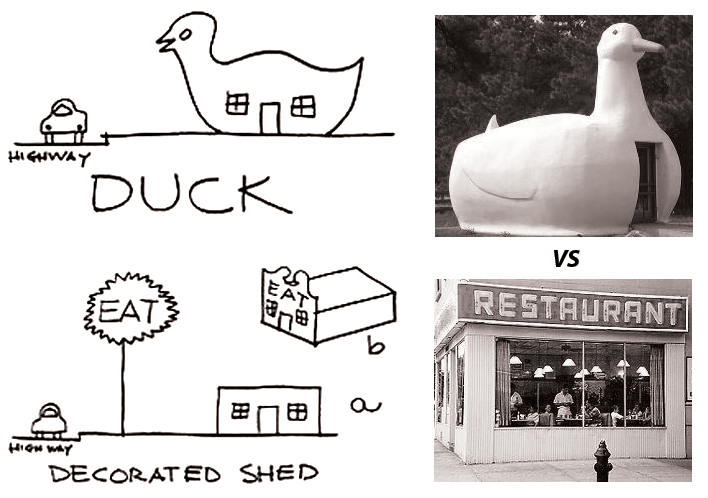
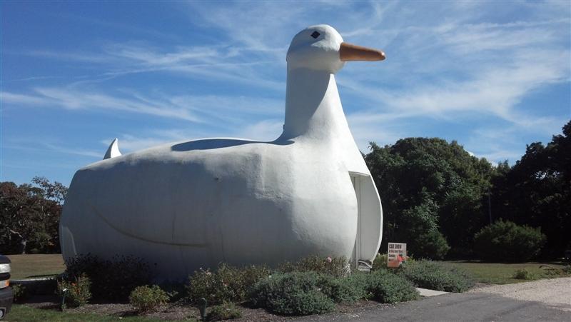
What I do not wish to do, however, is make the building imposing. This is potentially what could result if the design were to rise high up with all facades flush to the street. I much prefer the idea of creating an inviting space, albeit with definite distinctions within it. What does a live/ work building look like? On the subject of distinctions defining purpose, Robert Venturi and 'The Duck and the Decorated Shed' become appropriate. Venturi's observations led to him believing that buildings had begun to categorise themselves in two ways. The first, the decorated shed, was the idea that any building could house any function, so long as it is signified.
The duck example, referencing The Big Duck on Long Island, New York, has become the sign. The building is a place which actually sells ducks. It is an unmistakeable building, almost a landmark in its own right for standing out as something so unique. It is, admittedly, a very bold example of the point of distinction, but it proves the point. People understand what this building is, because it has created a distinction. It is not a house, nor a DIY store. This big duck is a building which sells ducks. And thats what I believe needs to happen in the work/ live space. There needs to be definite design decisions to differentiate retail from residential, work from life. Furthermore, I would like this distinction to go beyond the simple use of a sign.
www.fastcoexist.com/1679317/livework-the-future-of-living-where-you-work-and-working-where-you-live#3
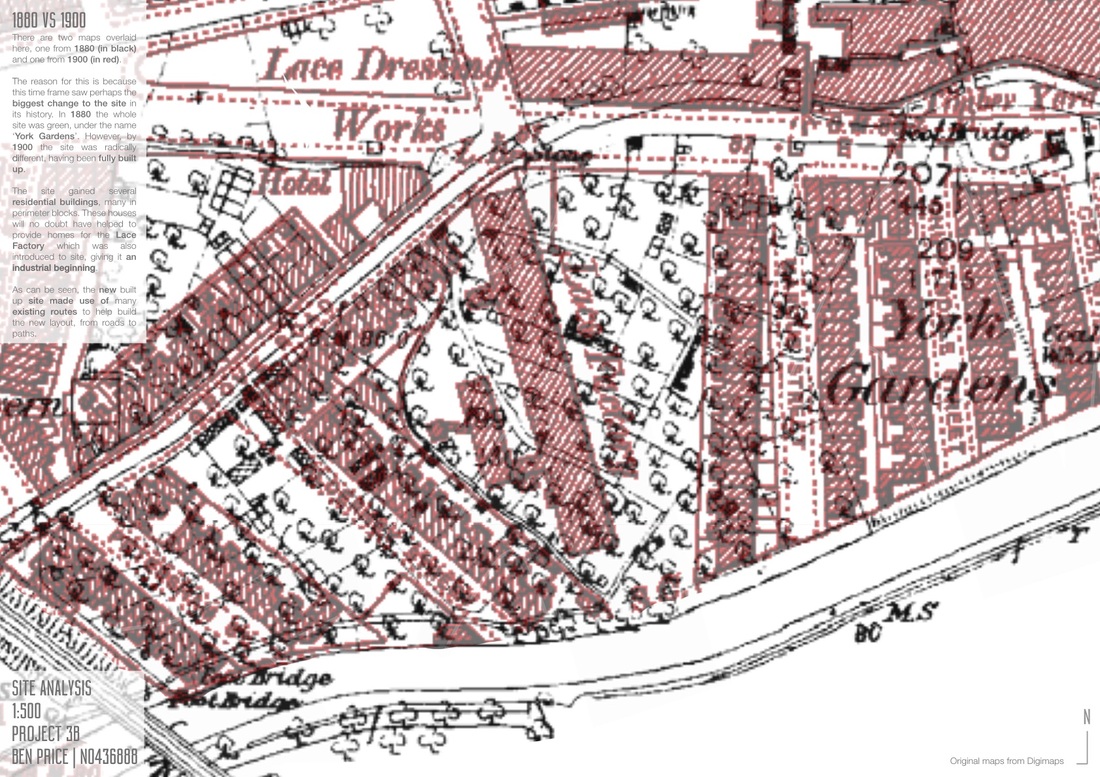
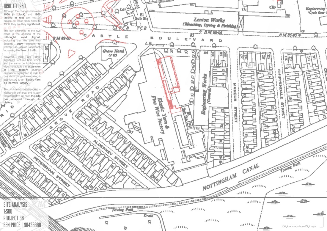
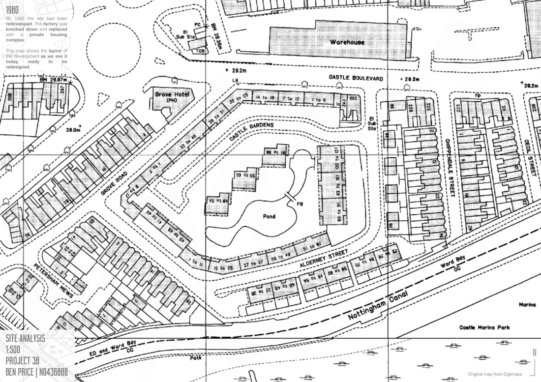
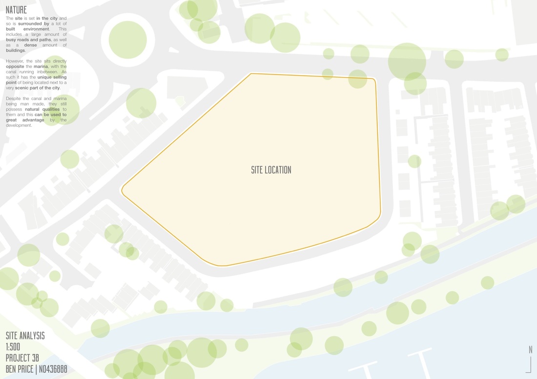
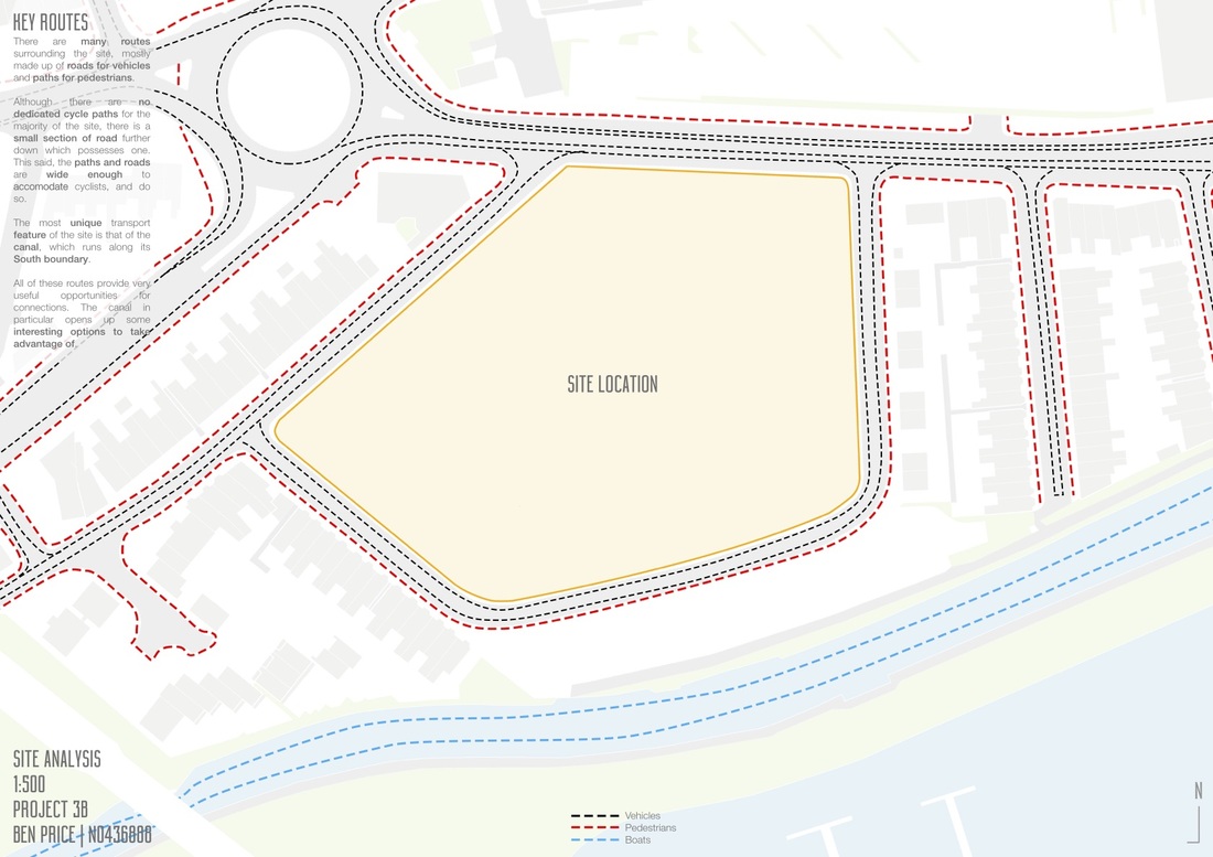
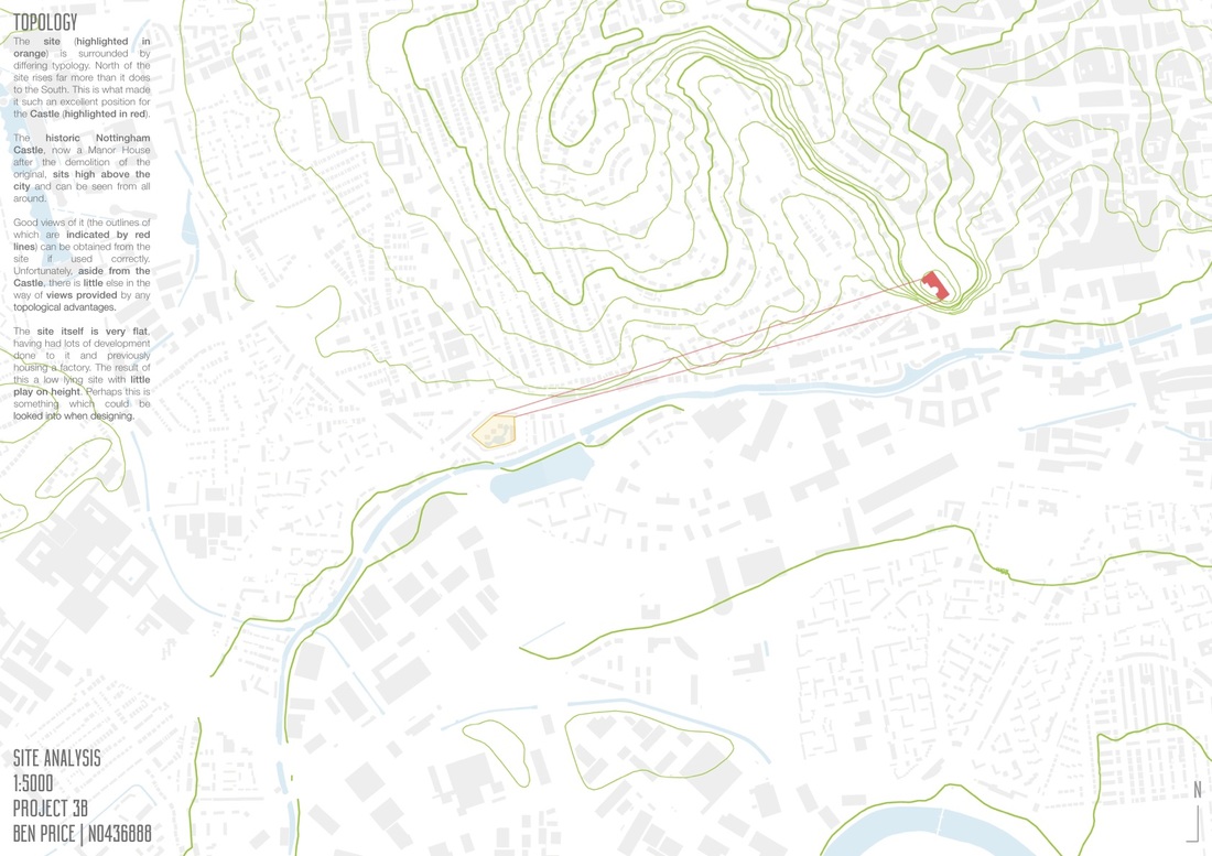
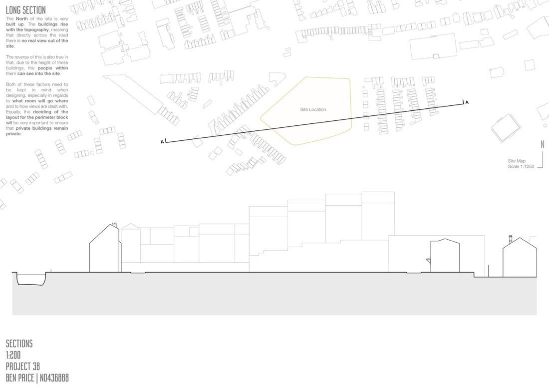
www.youtube.com/watch?v=fl0KJRv7fG4 www.contemporary-theory-khim.blogspot.co.uk/2013/02/6th-response-duck-and-decorated-shed.html www.gobigorgohomeblog.com/3222 www.beechwoodperiod5.edublogs.org/2012/09/05/meredith-sweasy-cultural-project/ www.madeofboxes.pl/files/20080528sculptit20.jpg To understand how best to redevelop the site, it is best to look into what is wrong with it now, as well as how it has been used in the past. A series of maps can be seen in the gallery below, with evaluations on each. All maps to scale when printed at A2
Project 3B focuses on designing a fundamental necessity of life, the home.
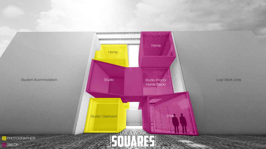
Following the years theme, this project is based around the Nottingham Canal. This time the focus on a site to the North of the canal which is in need of redevelopment. The site can be found by using the longitude and latitude of 52o56'46.5"N & 1o10'13.8"W. The area is full of residential buildings which form a private site. However there are many issues with it, especially in regards to layout, from the whole master plan to the positioning of the apartments themselves. As a group, the site will be redesigned using historical influence and better use of perimeter blocks. Following this, an example of one perimeter block will be taken and divided amongst the group. From there, each section shall be designed for individual clients. Although the design is individual, we will continue to work as a group to ensure our designs work with one another so that the whole neighbourhood works as one. The client which I have been assigned to develop and design for is that of the 'live/ work' typology. |
Project 3BLocation: Categories
All
|


 RSS Feed
